Mirror, mirror on the wall, let’s dispense with all of the obvious quips up front. I almost feel I should apologise for the spate of Midjourney posts – almost.
It should be painfully apparent that I’ve been noodling with Midjourney lately. I am not an accomplished digital artist, so I struggle. At times, I’m not sure if it’s me or it. Today, I’ll focus on mirrors.
Midjourney has difficulties rendering certain things. Centaurs are one. Mirrors, another. Whilst rendering vampires, another lesser struggle for the app, it became apparent that mirrors are not a forte. Here are some examples. Excuse the nudity. I’ll get to that later.
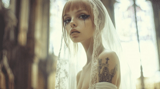
Prompt: cinematic, tight shot, photoRealistic light and shadow, exquisite details, delicate features, emaciated sensual female vampire waif with vampire fangs, many tattoos, wearing crucifix necklace, gazes into mirror, a beam of moonlight shines on her face in dark mausoleum interior, toward camera, facing camera, black mascara, long dark purple hair, Kodak Portra 400 with a Canon EOS R5
Ignore the other aspects of the images and focus on the behaviour or misbehaviour of the mirrors.
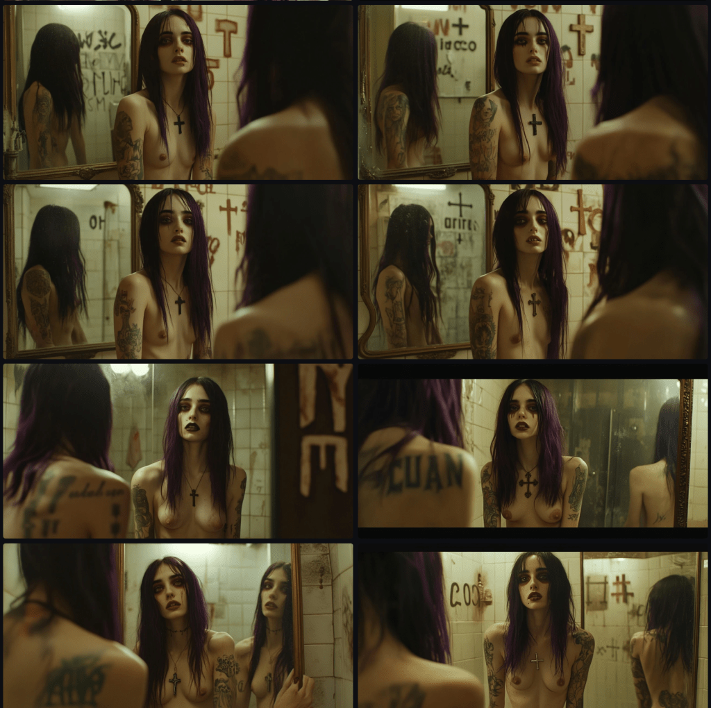
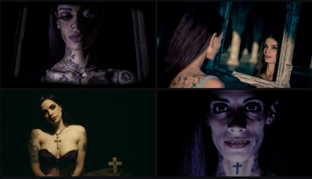
Image: Panel of vampire in a mirror.
Most apparent is the fact that vampires don’t have a reflection, but that’s not my nit. In the top four images, the reflection is orientated in the same direction as the subject. I’m only pretty sure that’s not how mirrors operate. In row 3, column 1, it may be correct. At least it’s close. In row 3, column 2 (and 4,2), the mirror has a reflection. Might there be another mirror behind the subject reflecting back? It goes off again in 4, 1, first in reflecting two versions of one subject. Also, notice that the subject’s hand, reaching the mirror, is not reflected. The orientation of the eyes is also suspect.
Image: Vampire in a mirror.
Here, our subject looks at the camera whilst her reflection looks at her.
Image: Vampire in a mirror.
Sans reflection, perhaps this is a real vampire. Her fangs are concealed by her lips?
Image: Vampire in a mirror.
Yet, another.
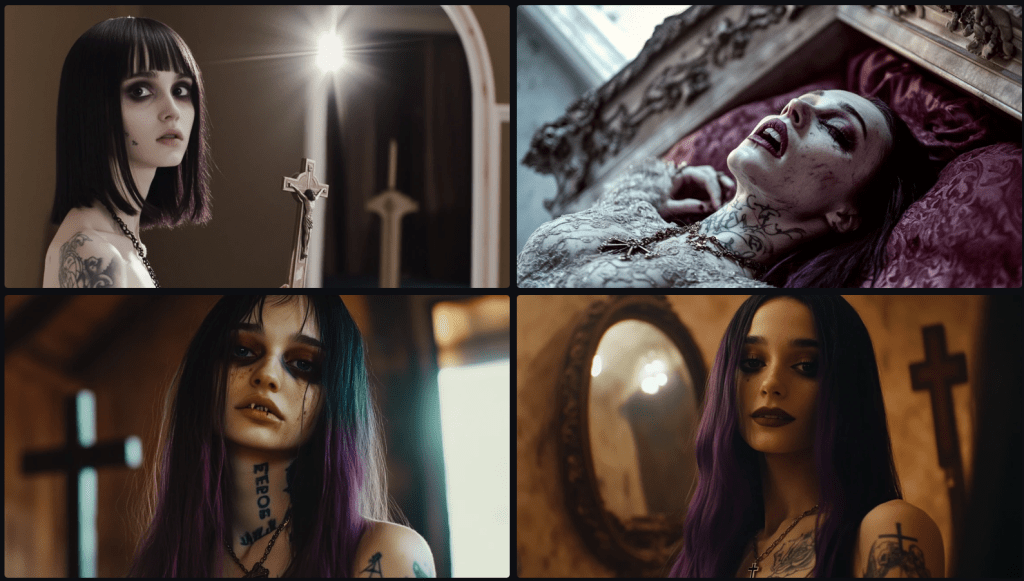
Image: Vampires in mirrors.
And more?
Image: Vampires in mirrors.
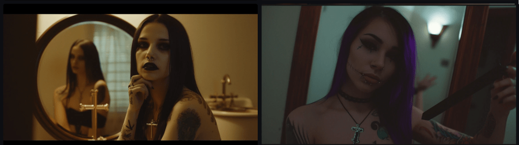
On the left, we have another front-facing reflection of a subject not looking into the mirror, and it’s not the same woman. Could it be a reflection of another subject – the woman is (somewhat) looking at.
On the right, whose hand is that in the mirror behind the subject?
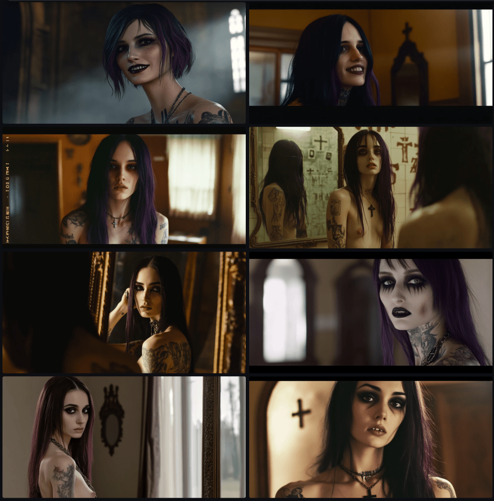
Image: Vampires in mirrors.
These are each mirrors. The first is plausible. The hands in the second are not a reflection; they grasp the frame. In the third and fourth, where’s the subject? The fangs appear to be displaced in the fourth.
Image: Vampires in mirrors.
In this set, I trust we’ve discovered a true vampire having no reflection.
Image: Vampires in mirrors.
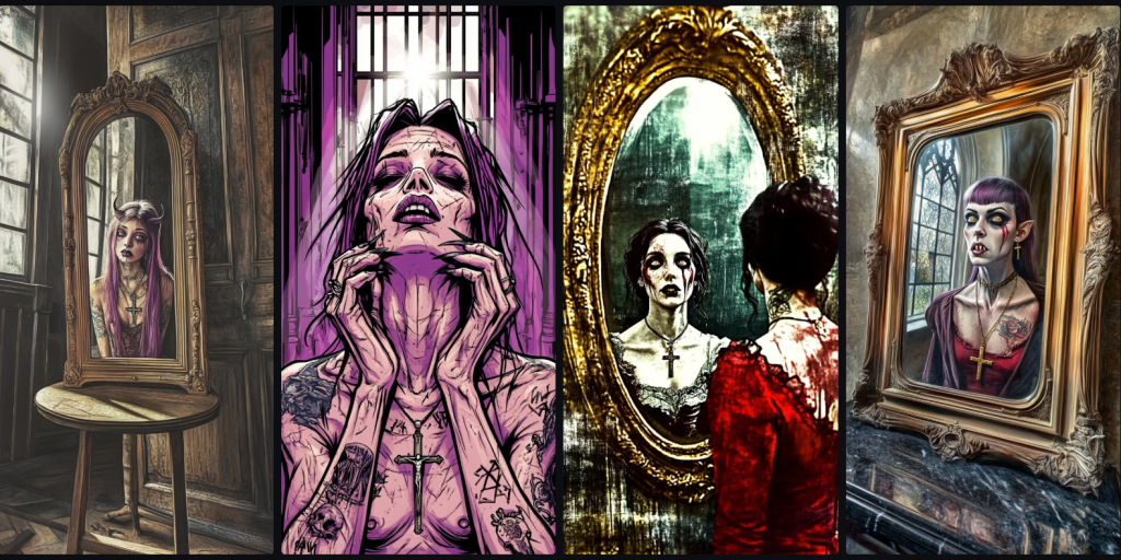
This last one is different still. It marks another series where I explored different comic book art styles, otherwise using the same prompt. Since it’s broken mirrors, I include it. Only the second really captures the 1980s style.
Remembering that, except for the first set of images, the same prompt was used. After the first set, the term ‘sensual’ has to be removed, as it was deemed to render offensive results. To be fair, the first set probably would be considered offensive to Midjourney, though it was rendered anyway.
It might be good to note that most of the images that were rendered without the word ‘sensual’ contain no blatant nudity. It’s as if the term itself triggers nudity because the model doesn’t understand the nuance. Another insufficiency of language is the inability to discern sensuality from sexuality, another human failing.
I decided to test my ‘sensual’ keyword hypothesis, so I entered a similar prompt but in French.
Prompt: Art de style bande dessinée des années 2010, détails exquis, traits délicats, femme vampire émaciée sensuelle de 20 ans montrant ses crocs de vampire, de nombreux tatouages, portant une collier crucifix, regarde dans le miroir, un faisceau de lumière de lune brille sur son visage à l’intérieur du mausolée sombre, vers la caméra, face à la caméra, mascara noir, longs cheveux violet foncé
Image : Vampires dans les miroirs.
I’ve added ‘sensuelle’, which was not blocked, et voilà, encore de la nudité.
Let’s evaluate the mirrors whilst we’re here.
In the first, we not only have a woman sans reflection, but disembodied hands grip the frame. In the second, a Grunge woman appears to be emerging from a mirror, her shoes reflected in the mirror beneath her. The last two appear to be reflections sans subject.
Notice, too, that the prompt calls for ‘une collier crucifix‘, so when the subject is not facing the viewer, the cross is rendered elsewhere, hence the cross on the back of the thigh and the middle of the back. Notice, too, the arbitrary presence of crosses in the environment, another confusion of subject and world.
That’s all for now. Next, I’ll take a trip through the different comic art styles over some decades.
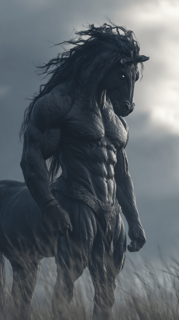
Why does Midjourney struggle so much with centaurs?
Image: Midjourney search results for ‘centaur‘
I’ve tried several times in the past year or so to generate a centaur. Why? Because I can’t. I’ve got no need for a centaur, but Midjourney won’t coöperate. I decided to search for it. This is the top of the results page. There is one centaur represented, #3, and there are a few others when I scroll down, but just look at the ratio – 1:18, 0.05%. Not stellar.
What even is this monstrosity – a horse with an extra pair of arms to wield a bow and arrow?
Clearly, just a mounted warrior.
Centaur in battle.
A Corgi riding a Corgi hybrid?
A bull-thing?
A warrior riding a seahorse?
A skeletal doom horse?
A pack-insect with a rider?
A riding ram?
My little pony-gazelle?
Ripped Red Hulk Bojack?
Gigantic Cerberus horse?
Jason Momoa bloke holding a rose?
Regular dude riding a regular horse.
Rearing a horse with horns.
Anthropomorphic horned-horse riding a buff unicorn.
An ancient warrior riding a horse.
A Minotaur.
Scrolling, there are more, but the ratio remains the same.
I was wrong. I scrolled several more pages and couldn’t find any more. Keep in mind that my search term was ‘centaur.’ It should have excluded everything else, but it was mostly everything else.
Before I quit, I decided to ask Dall-E and ChatGPT 4o to try. The AI also generated the compelling speech bubbles. Incroyable. 🤣
Image: Dall-E comic style render.Image: ChatGPT comic style render – centaur talks with a minotaur.
That’s enough for now. I’m glad I don’t actually need a centaur. smh
I am not a fan of Midjourney v7. I prefer v6.1. And I want to write about the correspondence of language, per my Language Insufficiency Hypothesis.
Let’s start with the language aspect. Notice how distant the renders are from the intent of the prompt.
This is my initial prompt. I used it about a year ago to generate the cover image with v6.1, but I wanted to see how it renders in v7. Let’s take a trip all the way back to the beginning.
cinematic, tight shot, photoRealistic light and shadow, exquisite details, delicate features, emaciated sensual female vampire waif with vampire fangs, many tattoos, wearing crucifix necklace, gazes into mirror, a beam of moonlight shines on her face in dark mausoleum interior, toward camera, facing camera, black mascara, long dark purple hair , Kodak Portra 400 with a Canon EOS R5
Image: Midjourney v6.1 render set (from about a year ago)
As you can see, these renders are somewhat lacking in photorealism, but the “sensual” term in the prompt was not blocked.
Midjourney v7
Initially, I encountered a hiccup. After a couple of rejections on the grounds of morality, I removed the word ‘sensual’ and received the output. All of the output uses this prompt absent the sensual term.
As mentioned, I have generated several images (including the cover image) with this prompt, but Midjourney is inconsistent in its censorship gatekeeping.
Image: Midjourney v7 render set
Notice that 3 of the 4 renders in the v7 set don’t even have a mirror. The top right one does, but it’s not evident that she’s a vampire. In fact, I could say that any of these are vampiresses, but perhaps that’s what they want you to believe. In place of a necklace, the lower right wokan sports a cross tattoo.
Midjourney v6.1
Image: Midjourney v6.1 render set
Again, these renders don’t appear to be vampires. The one on the lower left does appear to have snake-like fangs, so I guess I’ll give partial credit.
My next attempt was interrupted by this message.
It rendered something that might violate community guidelines. The funny thing is that one can watch the image generate in process. It only takes one “offensive” image to disqualify the whole batch.
Midjourney v6
Image: Midjourney v6 render set
Yet again, not a vampire to be found. Notice the reflection in the lower left image. Perhaps vampire reflections just behave differently.
Midjourney 5.2
Image: Midjourney v5.2 render set
Midjourney v5.2 was a crapshoot. Somehow, I got vampire lips (?), a Wiccan, a decrepit Snape from Harry Potter lore, and Iron Maiden’s Eddy reading a book. It’s something. I’m sensing gender dysphoria. Dare I go back further?
Midjourney v5.1
Image: Midjourney v5.1 render set
It gets worse. No comments necessary. Let’s turn back the clocks even more.
Midjourney v5
Image: Midjourney v5 render set
To be fair, these all do have occult undertones, but they are weak on vampireness.
Midjourney v4
Image: Midjourney v4 render set
To be fair, the render quality isn’t as bad as I expected, but it still falls short. There’s further back to travel.
Midjourney v3
Image: Midjourney v3 render set
Some configuration parameters no longer exist. Still, I persist for the sake of art and science at the cost of time and ecology.
As much as I complain – and I complain a lot – this is how far we’ve come. As I recall, this is when I hopped onto the Midjourney bandwagon. There’s still more depth to plumb. I have no idea how much of the prompt is simply ignored at this point.
Midjourney v2
Image: Midjourney v2 render set
What the hell is this? 🤔🤣 But I’m not done yet.
Midjourney v1
Image: Midjourney v1 render set
The damned grandpappy of them all. Apparently, colour hadn’t been invented yet. You can’t tell by these thumbnails, but the resolution on these early versions approaches that of a postage stamp.
Midjourney Niji 3
Image: Midjourney Niji 3 render set
I had forgotten about the Niji models from back in the day. There were 3 versions. I don’t recall where this slotted into the chronology. Obviously, not down here. I’ve only rendered the newest one. I think this was used primarily for anime outputs, but I might be mistaken.
Bones Content 1: Video
Video: Midjourney Render of Purported Vampiress
This is a video render of the same prompt used on this page.
Bonus Content 2: Midjourney v6.1 Content from 34 weeks ago
Same prompt.
Image: Midjourney v6.1 render set (several passes)
The upper left image reminds me of Kirsten Dunst. Again, notice the female breasts, highlighting Midjourney’s censorial schizophrenia.
Some apps boldly claim to enable lip syncing – to render speech from mouth movements. I’ve tried a few. None delivered. Not even close.
To conserve bandwidth (and sanity), I’ve rendered animated GIFs rather than MP4s. You’ll see photorealistic humans, animated characters, cartoonish figures – and, for reasons only the algorithm understands, a giant goat. All showcase mouth movements that approximate the utterance of phonemes and morphemes. Approximate is doing heavy lifting here.
Firstly, these mouths move, but they say nothing. I’ve seen plenty of YouTube channels that manage to dub convincing dialogue into celebrity clips. That’s a talent I clearly lack – or perhaps it’s sorcery.
Secondly, language ambiguity. I reflexively assume these AI-generated people are speaking English. It’s my first language. But perhaps, given their uncanny muttering, they’re speaking yours. Or none at all. Do AI models trained predominantly on English-speaking datasets default to English mouth movements? Or is this just my bias grafting familiar speech patterns onto noise?
Thirdly, don’t judge my renders. I’ve been informed I may have a “type.” Lies and slander. The goat was the AI’s idea, I assure you.
What emerges from this exercise isn’t lip syncing. It’s lip-faking. The illusion of speech, minus meaning, which, if we’re honest, is rather fitting for much of what generative AI produces.
EDIT: I hadn’t noticed the five fingers (plus a thumb) on the cover image.
I’m almost finished with A Language Insufficiency Hypothesis, the book I’ve been labouring over for what feels like the gestation period of a particularly reluctant elephant. To be clear: the manuscript is done. Written. Edited. Blessed. But there remains one final circle of publishing hell—the index.
Now, if you’re wondering how motivated I am to return to indexing, consider this: I’m writing this blog post instead. If that doesn’t scream avoidance with an airhorn, nothing will.
Audio: NotebookLM podcast on this topic.
I began indexing over a month ago. I made it through two chapters of eight, then promptly wandered off to write a couple of novellas. As you do. One started as a short story—famous last words—and evolved into a novella. The muse struck again. Another “short story” appeared, and like an unattended sourdough starter, it fermented into a 15,000-word novelette. Apparently, I write short stories the way Americans pour wine: unintentionally generous.
Apparently, I write short stories the way Americans pour wine: unintentionally generous.
With several unpublished manuscripts loitering on my hard drive like unemployed theatre majors, I figured it was time to release one into the wild. So I did. I published the novelette to Kindle, and just today, the paperback proof landed in my postbox like a smug little trophy.
And then, because I’m an unrepentant completionist (or a masochist—jury’s out), I thought: why not release the novella too? I’ve been told novellas and novelettes are unpopular due to “perceived value.” Apparently, people would rather buy a pound of gristle than 200 grams of sirloin. And yet, in the same breath, they claim no one has time for long books anymore. Perhaps these are different tribes of illiterates. I suppose we’ll find out.
Let’s talk logistics. Writing a book is only the beginning—and frankly, it’s the easy part. Fingers to keyboard, ideas to page. Done. I use Word, like most tragically conventional authors. Planning? Minimal. These were short stories, remember? That was the plan.
Next comes layout. Enter Adobe InDesign—because once you’ve seen what Word does to complex layouts, you never go back. Export to PDF, pray to the typographic gods, and move on.
Then there’s the cover. I lean on Illustrator and Photoshop. Photoshop is familiar, like a worn-in shoe; Illustrator is the smug cousin who turns up late but saves the day with scalable vectors. This time, I used Illustrator for the cover—lesson learnt from past pixelation traumas. Hardback to paperback conversion? A breeze when your artwork isn’t made of crayon scribbles and hope.
Covers, in case you’ve never assembled one, are ridiculous. Front. Back. Spine. Optional dust jacket if you’re feeling fancy (I wasn’t). You need titles, subtitles, your name in a legible font, and let’s not forget the barcode, which you will place correctly on the first attempt exactly never.
Unlike my first novel, where I enlisted someone with a proper design eye to handle the cover text, this time I went full minimalist. Think Scandinavian furniture catalogue meets existential despair. Classy.
Once the cover and interior are done, it’s time to wrestle with the publishing platforms. Everything is automated these days—provided you follow their arcane formatting commandments, avoid forbidden fonts, and offer up your soul. Submitting each book takes about an hour, not including the time lost choosing a price that balances “undervalued labour” and “won’t scare away cheapskates.”
Want a Kindle version? That’s another workflow entirely, full of tortured formatting, broken line breaks, and wondering why your chapter headings are now in Wingdings. Audiobooks? That’s a whole other circus, with its own animals and ringmasters. Honestly, it’s no wonder authors hire publishers. Or develop drinking problems.
But I’m stubborn. Which brings us full circle.
I’ve now got two books heading for daylight, a few more waiting in the wings, and one bloody non-fiction beast that won’t see release until I finish the damn index. No pseudonym this time. No hiding. Just me, owning my sins and hoping the final product lands somewhere between “insightful” and “mercifully short.”
So yes, life may well be a journey. But indexing is the bit where the satnav breaks, the road floods, and the boot falls off the car. Give me the destination any day. The journey can fuck right off.
The genesis of the Modernity Worldview Survey was Metamodernism. Is this still a thing? In recent years, metamodernism has emerged as a supposed successor to postmodernism, claiming to transcend the seemingly irreconcilable tensions between modernist sincerity and postmodern irony. Yet, upon closer examination, this framework reveals itself not as a genuine paradigm shift but rather as a modernist invention that fails to escape the very critiques it attempts to address.
Despite its claims of oscillation between poles, metamodernism betrays its modernist underpinnings through its implicit teleology and notion of progress. The very framing of “meta” as beyond or transcending suggests a linear progression that is fundamentally at odds with the postmodern rejection of grand narratives. Metamodernism positions itself as forward-moving whilst attempting to recapture elements of premodernity, revealing an anxiety about being perceived as regressive or naive.
Podcast: Audio version of this content
This desire to have it both ways—to acknowledge the constructed nature of meaning whilst still pursuing transcendent meaning—doesn’t represent a resolution so much as a psychological coping mechanism. The cognitive dissonance created by attempting to simultaneously hold contradictory positions is assuaged through a clever rhetorical move: claiming that oscillation itself is the point.
A Rebranding Exercise
What metamodernism presents as novel is ultimately a recombination of elements from premodern, modern, and postmodern frameworks without resolving their fundamental contradictions. Rather than being mutually exclusive from these earlier paradigms, it cherry-picks aspects of each whilst maintaining the basic ontological framework of modernism.
The notion that one can meaningfully “oscillate” between accepting objective and subjective realities is particularly problematic. Either reality has objective features, or it doesn’t—pretending otherwise doesn’t create a new philosophical paradigm but rather a convenient means of avoiding the implications of either position.
Postmodern Irony in Motion
Perhaps the most intriguing interpretation of metamodernism is not as a sincere attempt to move beyond postmodernism but as postmodernism performing its own critique. Viewed through this lens, metamodernism becomes postmodern irony in motion—a knowing wink at the impossibility of escaping construction whilst performatively engaging with the desire to do so.
The irony deepens when we consider that “postmodernism” itself is essentially an externally imposed label rather than a self-identification. Most thinkers characterised as postmodernists reject the label, which functions primarily as a modernist attempt to categorise and contain ideas that fundamentally challenge its frameworks.
Art vs. Philosophy
Where metamodernism succeeds is as a descriptive label for certain artistic and cultural productions that deliberately play in the space between irony and sincerity. Works like David Foster Wallace’s “Infinite Jest,” the television series “BoJack Horseman,” and Wes Anderson’s films effectively combine postmodern techniques with sincere emotional engagement.
However, what works as an artistic sensibility fails as a comprehensive philosophical framework or moral compass. The oscillation that enriches art becomes paralysing when applied to ethics or ontology. A moral framework requires some stable reference points; constantly shifting between believing in objective moral truths and viewing morality as entirely constructed provides no reliable guide for actual decision-making.
Insider vs. Outsider Perspectives
Like religious frameworks that balance literal and metaphorical interpretations, metamodernism may function as a lived experience for those who embrace it, even if it doesn’t hold up to external philosophical scrutiny. The cognitive manoeuvres that appear as tricks or inconsistencies to outsiders often feel like natural, intuitive ways of navigating complexity to those within the system.
This insider/outsider divide recalls Thomas Nagel’s famous “What Is It Like to Be a Bat?” (PDF) thought experiment—there may be experiential aspects of inhabiting a metamodern worldview that aren’t fully comprehensible from the outside. Yet this doesn’t invalidate external critique; inconsistencies and contradictions still matter philosophically.
Conclusion: Beyond Labels
Perhaps the most postmodern insight is recognising that we cannot escape having an ideology—even a position of having no ideology is itself an ideology. What distinguishes various approaches isn’t whether they have ideologies but how explicitly they acknowledge them, how consistently they apply them, and how willing they are to subject them to revision.
Metamodernism, for all its aspirations to transcend earlier frameworks, ultimately reveals more about our contemporary psychological condition than it offers as a coherent philosophical position. It captures our desire to maintain meaning in a world where we’ve recognised its contingency—a desire that may be fundamentally human, even if philosophically untenable.
Rather than seeking yet another “-ism” to resolve our existential and philosophical tensions, perhaps we might more honestly confront the limitations and partialities of all our frameworks, recognising that the search for a perfect synthesis may itself be a modernist fantasy.
I’ve written a lot on the insufficiency of language, and it’s not even an original idea. Language, our primary tool for sharing thoughts and ideas, harbours a fundamental flaw: it’s inherently insufficient for conveying precise meaning. While this observation isn’t novel, recent developments in artificial intelligence provide us with new ways to illuminate and examine this limitation. Through a progression from simple geometry to complex abstractions, we can explore how language both serves and fails us in different contexts.
Audio: NotebookLM summary podcast of this topic.
The Simple Made Complex
Consider what appears to be a straightforward instruction: Draw a 1-millimetre square in the centre of an A4 sheet of paper using an HB pencil and a ruler. Despite the mathematical precision of these specifications, two people following these exact instructions would likely produce different results. The variables are numerous: ruler calibration, pencil sharpness, line thickness, paper texture, applied pressure, interpretation of ‘centre’, and even ambient conditions affecting the paper.
This example reveals a paradox: the more precisely we attempt to specify requirements, the more variables we introduce, creating additional points of potential divergence. Even in mathematics and formal logic—languages specifically designed to eliminate ambiguity—we cannot escape this fundamental problem.
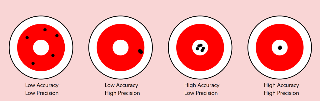
Precision vs Accuracy: A Useful Lens
The scientific distinction between precision and accuracy provides a valuable framework for understanding these limitations. In measurement, precision refers to the consistency of results (how close repeated measurements are to each other), while accuracy describes how close these measurements are to the true value.
Returning to our square example:
Precision: Two people might consistently reproduce their own squares with exact dimensions
Accuracy: Yet neither might capture the ‘true’ square we intended to convey
As we move from geometric shapes to natural objects, this distinction becomes even more revealing. Consider a maple tree in autumn. We might precisely convey certain categorical aspects (‘maple’, ‘autumn colours’), but accurately describing the exact arrangement of branches and leaves becomes increasingly difficult.
The Target of Meaning: Precision vs. Accuracy in Communication
To understand language’s limitations, we can borrow an illuminating concept from the world of measurement: the distinction between precision and accuracy. Imagine a target with a bullseye, where the bullseye represents perfect communication of meaning. Just as archers might hit different parts of a target, our attempts at communication can vary in both precision and accuracy.
Consider four scenarios:
Low Precision, Low Accuracy When describing our autumn maple tree, we might say ‘it’s a big tree with colourful leaves’. This description is neither precise (it could apply to many trees) nor accurate (it misses the specific characteristics that make our maple unique). The communication scatters widely and misses the mark entirely.
High Precision, Low Accuracy We might describe the tree as ‘a 47-foot tall maple with exactly 23,487 leaves displaying RGB color values of #FF4500’. This description is precisely specific but entirely misses the meaningful essence of the tree we’re trying to describe. Like arrows clustering tightly in the wrong spot, we’re consistently missing the point.
Low Precision, High Accuracy ‘It’s sort of spreading out, you know, with those typical maple leaves turning reddish-orange, kind of graceful looking.’ While imprecise, this description might actually capture something true about the tree’s essence. The arrows scatter, but their centre mass hits the target.
High Precision, High Accuracy This ideal state is rarely achievable in complex communication. Even in our simple geometric example of drawing a 1mm square, achieving both precise specifications and accurate execution proves challenging. With natural objects and abstract concepts, this challenge compounds exponentially.
The Communication Paradox
This framework reveals a crucial paradox in language: often, our attempts to increase precision (by adding more specific details) can actually decrease accuracy (by moving us further from the essential meaning we’re trying to convey). Consider legal documents: their high precision often comes at the cost of accurately conveying meaning to most readers.
Implications for AI Communication
This precision-accuracy framework helps explain why AI systems like our Midjourney experiment show asymptotic behaviour. The system might achieve high precision (consistently generating similar images based on descriptions) while struggling with accuracy (matching the original intended image), or vice versa. The gap between human intention and machine interpretation often manifests as a trade-off between these two qualities.
Our challenge, both in human-to-human and human-to-AI communication, isn’t to achieve perfect precision and accuracy – a likely impossible goal – but to find the optimal balance for each context. Sometimes, like in poetry, low precision might better serve accurate meaning. In other contexts, like technical specifications, high precision becomes crucial despite potential sacrifices in broader accuracy.
The Power and Limits of Distinction
This leads us to a crucial insight from Ferdinand de Saussure’s semiotics about the relationship between signifier (the word) and signified (the concept or object). Language proves remarkably effective when its primary task is distinction among a limited set. In a garden containing three trees – a pine, a maple, and a willow – asking someone to ‘point to the pine’ will likely succeed. The shared understanding of these categorical distinctions allows for reliable communication.
However, this effectiveness dramatically diminishes when we move from distinction to description. In a forest of a thousand pines, describing one specific tree becomes nearly impossible. Each additional descriptive detail (‘the tall one with a bent branch pointing east’) paradoxically makes precise identification both more specific and less likely to succeed.
An AI Experiment in Description
To explore this phenomenon systematically, I conducted an experiment using Midjourney 6.1, a state-of-the-art image generation AI. The methodology was simple:
Generate an initial image
Describe the generated image in words
Use that description to generate a new image
Repeat the process multiple times
Attempt to refine the description to close the gap
Continue iterations
The results support an asymptotic hypothesis: while subsequent iterations might approach the original image, they never fully converge. This isn’t merely a limitation of the AI system but rather a demonstration of language’s fundamental insufficiency.
A cute woman and her dog stand next to a tree
One can already analyse this for improvements, but let’s parse it together.
a cute woman
With this, we know we are referencing a woman, a female of the human species. There are billions of women in the world. What does she look like? What colour, height, ethnicity, and phenotypical attributes does she embody?
We also know she’s cute – whatever that means to the sender and receiver of these instructions.
I used an indefinite article, a, so there is one cute woman. Is she alone, or is she one from a group?
It should be obvious that we could provide more adjectives (and perhaps adjectives) to better convey our subject. We’ll get there, but let’s move on.
and
We’ve got a conjunction here. Let’s see what it connects to.
her dog
She’s with a dog. In fact, it’s her dog. This possession may not be conveyable or differentiable from some arbitrary dog, but what type of dog is it? Is it large or small? What colour coat? Is it groomed? Is it on a leash? Let’s continue.
stand
It seems that the verb stand refers to the woman, but is the dog also standing, or is she holding it? More words could qualify this statement better.
next to a tree
A tree is referenced. Similar questions arise regarding this tree. At a minimum, there is one tree or some variety. She and her dog are next to it. Is she on the right or left of it?
We think we can refine our statements with precision and accuracy, but can we? Might we just settle for “close enough”?
Let’s see how AI interpreted this statement.
Image: Eight Midjourney renders from the prompt: A cute woman and her dog stand next to a tree. I’ll choose one of these as my source image.
Let’s deconstruct the eight renders above. Compositionally, we can see that each image contains a woman, a dog, and a tree. Do any of these match what you had in mind? First, let’s see how Midjourney describes the first image.
In a bout of hypocrisy, Midjourney refused to /DESCRIBE the image it just generated.
Last Midjourney description for now.
Let’s cycle through them in turn.
A woman is standing to the left of an old-growth tree – twice identified as an oak tree. She’s wearing faded blue jeans and a loose light-coloured T-shirt. She’s got medium-length (maybe) red-brown hair in a small ponytail. A dog – her black and white dog identified as a pitbull, an American Foxhound, and an American Bulldog – is also standing on his hind legs. I won’t even discuss the implied intent projected on the animal – happy, playful, wants attention… In two of the descriptions, she’s said to be training it. They appear to be in a somewhat residential area given the automobiles in the background. We see descriptions of season, time of day, lighting, angle, quality,
A woman is standing to the right of an old-growth tree. She’s wearing short summer attire. Her dog is perched on the tree.
An older woman and her dog closer up.
A read view of both a woman and her dog near an oak tree.
As it turned out, I wasn’t thrilled with any of these images, so I rendered a different one. Its description follows.
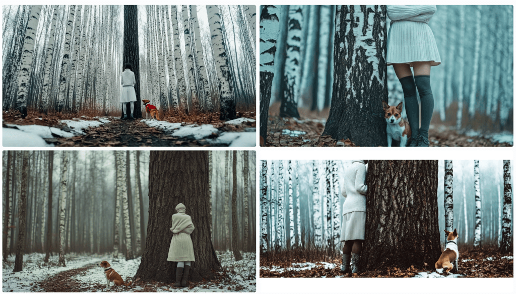
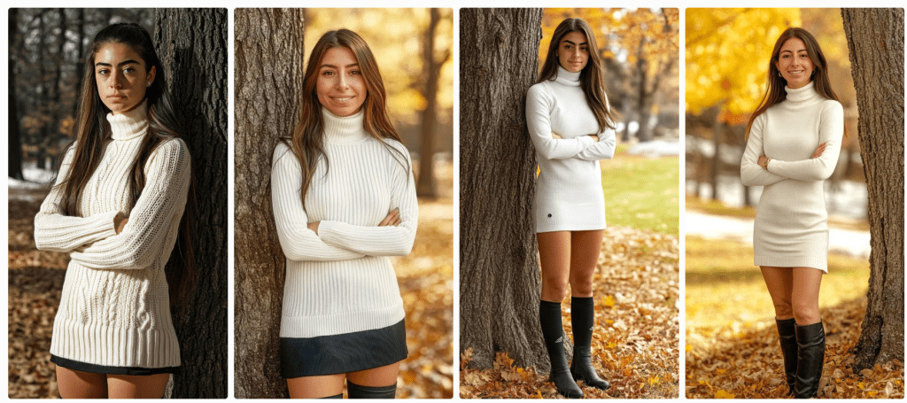
The consensus is that ‘a beautiful girl in a white dress and black boots stands next to a tree’ with a Jack Russell Terrier dog. I see birch trees and snow. It’s overcast. Let’s spend some time trying to reproduce it. To start, I’m consolidating the above descriptions. I notice some elements are missing, but we’ll add them as we try to triangulate to the original image.
A beautiful girl in a white dress and black boots stands next to a tree in a winter forest with birch trees. A Jack Russell Terrier dog is nearby, and the weather is cloudy. The photo has a cinematic style. --ar 128:71
This is pretty far off the mark. We need to account for the overall setting and composition, relative positioning, clothing, hair, camera, perspective – even lighting and film emulsion.
Let’s see how we can refine it with some adjectives. Before this, I asked Anthropic’s Claude 3.5 to describe the image. Perhaps we’ll get more details.
An atmospheric winter photograph was taken in what appears to be a birch and pine forest. The ground is partially covered with snow, creating a patchy pattern of white snow and brown leaves or soil. In the image, there's a person wearing winter attire consisting of a white knit turtleneck sweater, a white skirt, dark knee-high socks, and grey lace-up boots. They're standing against a large tree trunk with their arms crossed. Next to them is a Jack Russell Terrier mix dog with distinctive brown and white colouring. The dog appears to be well-behaved, sitting attentively beside the tree. The composition is quite striking, with the massive dark tree trunk serving as a central focal point against the misty, winter forest background. The white clothing of the person creates a visual echo with the white bark of birch trees visible in the background, as well as with the patches of snow on the ground. The overall mood of the photo is somewhat moody and contemplative, enhanced by what appears to be overcast lighting and the misty quality of the forest in the background. The colour palette is largely monochromatic, dominated by whites, greys, and browns, which adds to the winter atmosphere of the scene.
We don’t seem to be moving in a good direction. Let’s modify the initial prompt.
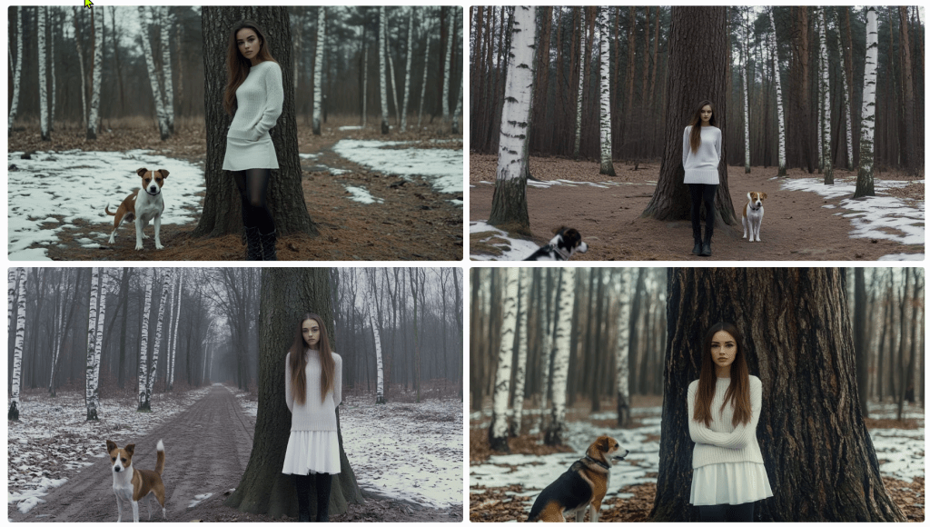
A beautiful girl in a white dress and tall laced black boots stands facing the camera to the right of large oak tree centred in the foreground of a winter forest with birch trees in the background. To the left of the tree is a Jack Russell Terrier dog looking at the camera, and the weather is cloudy. The photo has a cinematic style. --ar 128:71
I’ll allow the results to speak for themselves. Let’s see if we can’t get her out of the wedding gown and into a white jumper and skirt. I’ll bold the amends.
A beautiful girl in a white jumper and skirt wearing black leggings and tall laced black boots stands facing the camera to the right of large oak tree centred in the foreground of a winter forest with birch trees in the background. To the left of the tree is a Jack Russell Terrier dog looking at the camera, and the weather is cloudy. The photo has a cinematic style. --ar 128:71
s
A beautiful young woman with long brown hair pulled to the side of her face in a white jumper and white skirt wearing black leggings under tall laced black boots stands facing the camera to the right of large oak tree centred in the foreground of a winter forest with birch trees in the background. Patchy snow is on the ground. To the left of the tree is a Jack Russell Terrier dog looking at the camera, and the weather is overcast. The photo has a cinematic style. --ar 128:71
What gives?
I think my point has been reinforced. I’m getting nowhere fast. Let’s give it one more go and see where we end up. I’ve not got a good feeling about this.
A single large oak tree centred in the foreground of a winter forest with birch trees in the background. Patches of snow is on the ground. To the right of the oak tree stands a beautiful young woman with long brown hair pulled to the side of her face in a white jumper and white skirt wearing black boots over tall laced black boots. She stands facing the camera. To the left of the tree is a Jack Russell Terrier dog looking at the camera, and the weather is overcast. The photo has a cinematic style. --ar 128:71
With this last one, I re-uploaded the original render along with this text prompt. Notice that the girl now looks the same and the scene (mostly) appears to be in the same location, but there are still challenges.
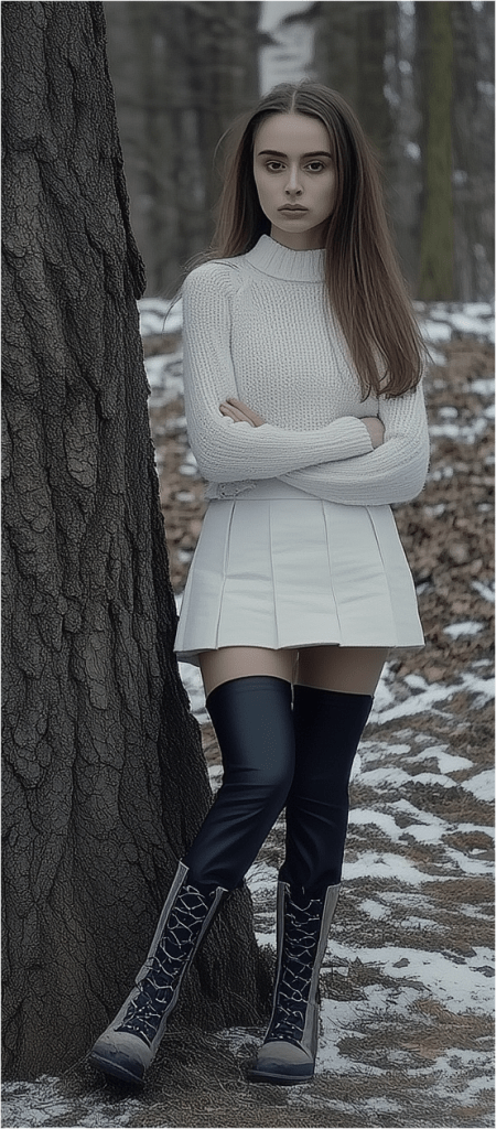
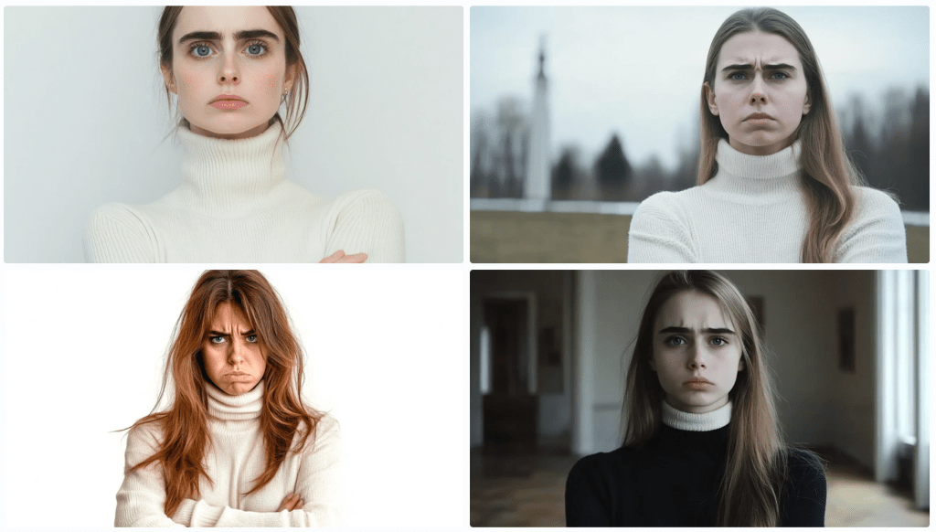
After several more divergent attempts, I decided to focus on one element – the girl.
As I regard the image, I’m thinking of a police sketch artist. They get sort of close, don’t they? They’re experts. I’m not confident that I even have the vocabulary to convey accurately what I see. How do I describe her jumper? Is that a turtleneck or a high collar? It appears to be knit. Is is wool or some blend? does that matter for an image? Does this pleated skirt have a particular name or shade of white? It looks as though she’s wearing black leggings – perhaps polyester. And those boots – how to describe them. I’m rerunning just the image above through a describe function to see if I can get any closer.
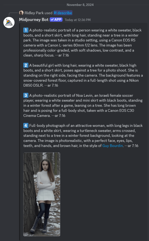
These descriptions are particularly interesting and telling. First, I’ll point out that AI attempts to identify the subject. I couldn’t find Noa Levin by a Google search, so I’m not sure how prominent she might be if she even exists at all in this capacity. More interesting still, the AI has placed her in a scenario where the pose was taken after a match. Evidently, this image reflects the style of photographer Guy Bourdin. Perhaps the jumper mystery is solved. It identified a turtleneck. I’ll ignore the tree and see if I can capture her with an amalgamation of these descriptions. Let’s see where this goes.
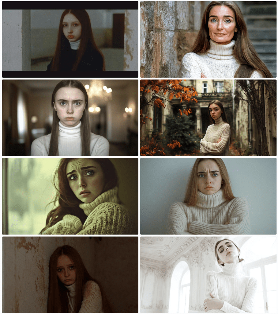
A photo-realistic portrait of Israeli female soccer player Noa Levin wearing a white turtleneck sweater, arms crossed, black boots, and a short skirt, with long brown hair, standing near a tree in a winter park. The image captured a full-length shot taken in a studio setting, using a Canon EOS R5 camera with a Canon L-series 80mm f/2 lens. The image has been professionally color-graded, with soft shadows, low contrast, and a clean, sharp focus. --ar 9:16
Close-ish. Let’s zoom in to get better descriptions of various elements starting with her face and hair.
Now, she’s a sad and angry Russian woman with (very) pale skin; large, sad, grey eyes; long, straight brown hair. Filmed in the style of either David LaChapelle or Alini Aenami (apparently misspelt from Alena Aenami). One thinks it was a SnapChat post. I was focusing on her face and hair, but it notices her wearing a white (oversized yet form-fitting) jumper sweater and crossed arms .
I’ll drop the angry bit – and then the sad.
Stick a fork in it. I’m done. Perhaps it’s not that language is insufficient; it that my language skills are insufficient. If you can get closer to the original image, please forward the image, the prompt, and the seed, so I can post it.
The Complexity Gradient
A clear pattern emerges when we examine how language performs across different levels of complexity:
Categorical Distinction (High Success)
Identifying shapes among limited options
Distinguishing between tree species
Basic color categorization
Simple Description (Moderate Success)
Basic geometric specifications
General object characteristics
Broad emotional states
Complex Description (Low Success)
Specific natural objects
Precise emotional experiences
Unique instances within categories
Abstract Concepts (Lowest Success)
Philosophical ideas
Personal experiences
Qualia
As we move up this complexity gradient, the gap between intended meaning and received understanding widens exponentially.
The Tolerance Problem
Understanding these limitations leads us to a practical question: what level of communicative tolerance is acceptable for different contexts? Just as engineering embraces acceptable tolerances rather than seeking perfect measurements, perhaps effective communication requires:
Acknowledging the gap between intended and received meaning
Establishing context-appropriate tolerance levels
Developing better frameworks for managing these tolerances
Recognizing when precision matters more than accuracy (or vice versa)
Implications for Human-AI Communication
These insights have particular relevance as we develop more sophisticated AI systems. The limitations we’ve explored suggest that:
Some communication problems might be fundamental rather than technical
AI systems may face similar boundaries as human communication
The gap between intended and received meaning might be unbridgeable
Future development should focus on managing rather than eliminating these limitations
Conclusion
Perhaps this is a simple exercise in mental masturbation. Language’s insufficiency isn’t a flaw to be fixed but a fundamental characteristic to be understood and accommodated. By definition, it can’t be fixed. The gap between intended and received meaning may be unbridgeable, but acknowledging this limitation is the first step toward more effective communication. As we continue to develop AI systems and push the boundaries of human-machine interaction, this understanding becomes increasingly critical.
Rather than seeking perfect precision in language, we might instead focus on:
Developing new forms of multimodal communication
Creating better frameworks for establishing shared context
Accepting and accounting for interpretative variance
Building systems that can operate effectively within these constraints
Understanding language’s limitations doesn’t diminish its value; rather, it helps us use it more effectively by working within its natural constraints.