I wrote and published this article on LinkedIn. I even recycled the cover image. Although it is about the particular topic of Agile, it relates to the Language Insufficiency Hypothesis, so I felt it would be apt here as well. It demonstrates how to think about language insufficiency through the framework.
Agile in Name Only
For over two decades, I’ve been immersed in Agile and its myriad interpretations. One refrain has persisted throughout: Agile™ is “just about agility,” a term that anyone can define as they see fit. The ambiguity begs the question: What does it really mean?
On its face, this sounds inclusive, but it never passed my intuitive sniff test. I carried on, but as I reflected on my broader work concerning the insufficiency of language, this persistent fuzziness started to make sense. Agile’s conceptual murkiness can be understood through the lens of language and identity—particularly through in-group and out-group dynamics.
Otherness and the Myth of Universality
To those who truly understand agility, no elaborate definition is required. It’s instinctive, embedded in their DNA. They don’t need to label it; they simply are agile. Yet, for the out-group—the ones who aspire to the status without the substance—Agile™ becomes a muddy abstraction. Unable to grasp the core, they question its very existence, claiming, “Who really knows what Agile means?”
The answer is simple: Everyone but those asking this question.
The Agility Crisis
This disconnect creates a power shift. The in-group, small and focused, operates with quiet competence. Meanwhile, the out-group, larger and louder, hijacks the conversation. What follows is an inevitable dilution: “Agile is dead,” “Agile doesn’t work,” they declare. But these proclamations often reflect their own failures to execute or evolve, not flaws inherent to agility itself.
This pattern follows a familiar playbook: create a strawman—define Agile™ as something it’s not—then decry its inability to deliver. The result? Performative agility, a theatre of motion without progress, where the players confuse activity for achievement and rely on brittle, inextensible infrastructures.
Agile Beyond the Label
Ironically, the true practitioners of agility remain unbothered by these debates. They adapt, innovate, and thrive—with or without the label. Agile™ has become a victim of its own success, co-opted by those who misunderstand it, leading to a paradox: the louder the chorus claiming “Agile doesn’t work,” the more it underscores the gap between those who do agility and those who merely wear its name.
The lesson here is not just about Agile™ but about language itself. Words, when untethered from their essence, fail. They cease to communicate, becoming tools of obfuscation rather than clarity. In this, Agile™ mirrors a broader phenomenon: the insufficiency of language in the face of complexity and its misuse by those unwilling or unable to engage with its deeper truths.
Let’s talk about Less Than Zero. No, not the film. I’m talking about the book—Bret Easton Ellis’s nihilistic masterpiece that drags you through a moral cesspit of 1980s Los Angeles. You might remember it as the story that makes American Psycho look like a quirky self-help guide. It’s dark, it’s bleak, and it doesn’t pretend to offer you a shred of hope.
And then there’s the movie adaptation.
Oh, the movie. It’s as though someone read Ellis’s unflinching tale of moral rot and thought, You know what this needs? Friendship. And a redemption arc. And maybe some heartfelt music in the background. Hollywood, in all its infinite wisdom, decided that audiences couldn’t handle the book’s existential despair. So, they took a story about the void—about the emptiness of privilege, the suffocation of apathy, and the complete erosion of human connection—and gave it a fuzzy moral centre.
Here’s the gist: The book is nihilism incarnate. It follows Clay, a disaffected college student who comes home to LA for Christmas and is immediately swallowed whole by a world of cocaine, vapid socialites, and casual cruelty. No one learns anything. No one grows. In fact, the whole point is that these characters are so morally bankrupt, so irreparably hollow, that they’re beyond redemption. If you’re looking for a happy ending, don’t bother—Ellis leaves you stranded in the abyss, staring into the void, wondering if there’s any point to anything. Spoiler: there’s not.
Then along comes the 1987 film, directed by Marek Kanievska. It keeps the names of the characters—Clay, Blair, Julian—but not much else. Instead of being an icy observer of LA’s decadence, Clay is transformed into a love-struck saviour. Blair, a passive figure in the novel, becomes a supportive girlfriend. And Julian—oh, poor Julian—is turned into a sacrificial lamb for the sake of a heartfelt narrative about friendship and second chances.
The film turns Less Than Zero into an anti-drug PSA. It’s basically Nancy Reagan Presents: a story of addiction, redemption, and the power of love, wrapped in a slick 80s aesthetic. Robert Downey Jr., to his credit, gives a brilliant performance as Julian, the doomed addict. But the character is barely recognisable compared to his literary counterpart. In the book, Julian’s descent into drug-fuelled depravity isn’t a cautionary tale—it’s just another symptom of a world where nothing and no one has any value. In the film, Julian is tragic, yes, but in a way that invites sympathy and, crucially, an attempt at salvation.
Let’s not forget the ending. The novel ends on a note so cold it could freeze your soul: Clay leaves Los Angeles, unchanged, unbothered, and unmoved. The film, however, concludes with Clay and Blair driving off into the sunset, having vowed to turn their lives around. It’s saccharine. It’s pandering. It’s the cinematic equivalent of slapping a motivational poster over a painting by Francis Bacon.
Why did Hollywood do this? Simple: nihilism doesn’t sell. You can’t slap it on a movie poster and expect audiences to line up at the box office. People want catharsis, not existential despair. And so, the filmmakers gutted Less Than Zero of its soul (or lack thereof), replacing its stark nihilism with a hopeful narrative about the power of human connection.
Here’s the kicker, though: by doing this, the film completely misses the point of Ellis’s novel. Less Than Zero is a critique of LA’s shallow, soulless culture—a world where connection is impossible because no one feels anything. Turning it into a feel-good story about saving a friend from addiction is not just a betrayal; it’s downright laughable. It’s like adapting 1984 into a rom-com where Winston and Julia overthrow Big Brother and live happily ever after.
To be fair, the film isn’t bad—if you forget the source material exists. It’s well-acted, stylishly shot, and undeniably entertaining. But as an adaptation, it’s a travesty. It’s Ellis’s Less Than Zero with all the edges sanded down, the grit scrubbed clean, and a shiny coat of sentimentality slapped on top.
So, if you’ve read the book and thought, Wow, that was bleak—I wonder if the movie is any lighter?, the answer is yes, but not in a good way. It’s lighter because it’s hollowed out, stripped of its existential weight, and repackaged as something safe and digestible.
And if you haven’t read the book? Do yourself a favour: skip the movie, pour yourself a stiff drink, and dive into Ellis’s bleak masterpiece. Just don’t expect any warm, fuzzy feelings—it’s called Less Than Zero for a reason.
As I am putting some finishing touches on my latest paper, I had the idea to illustrate some of the novel nomenclature. For some reason, Zeno’s Paradox came to mind. Unlike in maths, it is not reconcilable in language. I asked ChatGPT how I might integrate the concept into my paper. Here is what it rendered. Not only is the exposition decent, but it also provides citations and references. Humorously, when I read the citations, I thought that they were placeholders – Brown, David, Smith, and Jones – but they turned out to be legitimate references – references I hadn’t considered and each relatively recent. I’m chalking this up as a win. This was not a case of ‘ChatGPT, do my homework’. Instead, it reflects an active collaboration between a human and technology. And now I have more reference papers to read and absorb.*
Take the term ‘freedom’, an archetypal example of a Contestable that resists precise communication due to its inherent abstraction and ideological weight. To enhance its effectiveness, we might parse it into narrower forms, such as ‘freedom from’ (liberation from oppression or constraint) and ‘freedom to’ (the capacity to act or pursue desires). Whilst this initial breakdown provides some clarity, it is merely the beginning. Each parsed term demands further qualification: ‘freedom from what?’ and ‘freedom to do what?’ At every level of subdivision, new ambiguities emerge, requiring further refinement (Smith, 2021).
This process resembles Zeno’s paradox, where each attempt to clarify ‘freedom’ by moving incrementally closer to a precise meaning only reveals new layers of interpretive complexity. The concept remains elusive, perpetually deferring any definitive understanding as we approach it in ever-smaller fragments without fully grasping its essence (Jones, 2019). Unlike concrete terms like ‘chair’ or ‘table’, whose meanings can be pinned down through physical reference or functional description, ‘freedom’ resists final articulation (Brown, 2020). This continual parsing illustrates the inherent limitations of language when applied to abstract, boundary-resistant concepts: the more we attempt to define them, the more they fracture into an infinite regress of sub-concepts, each requiring its own explanation (Davis, 2022). Thus, whilst parsing ‘freedom’ improves communicative effectiveness to a point, it ultimately underscores language’s impotence in capturing the full spectrum of complex, ideational constructs (Wilson, 2018).
References:
Brown, J. (2020). The elusive nature of abstract concepts. Journal of Philosophical Studies, 35(2), 123-145.
Davis, S. (2022). Language and the limits of definition. Linguistic Quarterly, 57(1), 78-92.
Jones, M. (2019). Zeno’s paradox and the infinite regress of meaning. Metaphysical Review, 82(3), 245-263.
Smith, L. (2021). Freedom and its discontents: A study in semantic complexity. Political Philosophy Today, 14(2), 56-78.
Wilson, G. (2018). The impotence of language in capturing ideational constructs. Journal of Language and Meaning, 27(4), 198-215.
* References: Here’s the twist. When I went to read the cited references, none were found. Here’s what ChatGPT had to say about it:
I understand your difficulty in locating the references you’ve mentioned. It appears that the articles by Brown (2020), Davis (2022), Jones (2019), and Smith (2021) may not exist in the public domain or could be hypothetical examples. Consequently, Digital Object Identifiers (DOIs) for these works are unavailable.
If you’re interested in exploring topics related to abstract concepts, the limits of language, or semantic complexity, I can recommend some reputable sources:
“The Challenges of Abstract Concepts” by Guy Dove (2021): This chapter discusses the theoretical challenges posed by abstract concepts and reviews current evidence and responses. Springer Link
“Abstract Concepts and Metacognition: Searching for Meaning in Self and Others” by Anna M. Borghi, Chiara Fini, and Luca Tummolini (2021): This work explores the role of metacognition in understanding abstract concepts. Springer Link
“The Limits of Language: Wittgenstein’s Later Philosophy and Skinner’s Verbal Behavior” by R. Harre (1983): This article examines the limitations of language through the perspectives of Wittgenstein and Skinner. JSTOR
“Varieties of Abstract Concepts and Their Multiple Dimensions” by Anna M. Borghi et al. (2018): This paper discusses the representation of abstract concepts and the different criteria used to select them. Cambridge University Press
These sources should provide valuable insights into the subjects you’re interested in.
I’ve written a lot on the insufficiency of language, and it’s not even an original idea. Language, our primary tool for sharing thoughts and ideas, harbours a fundamental flaw: it’s inherently insufficient for conveying precise meaning. While this observation isn’t novel, recent developments in artificial intelligence provide us with new ways to illuminate and examine this limitation. Through a progression from simple geometry to complex abstractions, we can explore how language both serves and fails us in different contexts.
Audio: NotebookLM summary podcast of this topic.
The Simple Made Complex
Consider what appears to be a straightforward instruction: Draw a 1-millimetre square in the centre of an A4 sheet of paper using an HB pencil and a ruler. Despite the mathematical precision of these specifications, two people following these exact instructions would likely produce different results. The variables are numerous: ruler calibration, pencil sharpness, line thickness, paper texture, applied pressure, interpretation of ‘centre’, and even ambient conditions affecting the paper.
This example reveals a paradox: the more precisely we attempt to specify requirements, the more variables we introduce, creating additional points of potential divergence. Even in mathematics and formal logic—languages specifically designed to eliminate ambiguity—we cannot escape this fundamental problem.
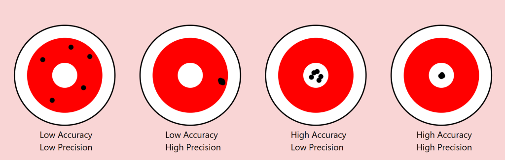
Precision vs Accuracy: A Useful Lens
The scientific distinction between precision and accuracy provides a valuable framework for understanding these limitations. In measurement, precision refers to the consistency of results (how close repeated measurements are to each other), while accuracy describes how close these measurements are to the true value.
Returning to our square example:
Precision: Two people might consistently reproduce their own squares with exact dimensions
Accuracy: Yet neither might capture the ‘true’ square we intended to convey
As we move from geometric shapes to natural objects, this distinction becomes even more revealing. Consider a maple tree in autumn. We might precisely convey certain categorical aspects (‘maple’, ‘autumn colours’), but accurately describing the exact arrangement of branches and leaves becomes increasingly difficult.
The Target of Meaning: Precision vs. Accuracy in Communication
To understand language’s limitations, we can borrow an illuminating concept from the world of measurement: the distinction between precision and accuracy. Imagine a target with a bullseye, where the bullseye represents perfect communication of meaning. Just as archers might hit different parts of a target, our attempts at communication can vary in both precision and accuracy.
Consider four scenarios:
Low Precision, Low Accuracy When describing our autumn maple tree, we might say ‘it’s a big tree with colourful leaves’. This description is neither precise (it could apply to many trees) nor accurate (it misses the specific characteristics that make our maple unique). The communication scatters widely and misses the mark entirely.
High Precision, Low Accuracy We might describe the tree as ‘a 47-foot tall maple with exactly 23,487 leaves displaying RGB color values of #FF4500’. This description is precisely specific but entirely misses the meaningful essence of the tree we’re trying to describe. Like arrows clustering tightly in the wrong spot, we’re consistently missing the point.
Low Precision, High Accuracy ‘It’s sort of spreading out, you know, with those typical maple leaves turning reddish-orange, kind of graceful looking.’ While imprecise, this description might actually capture something true about the tree’s essence. The arrows scatter, but their centre mass hits the target.
High Precision, High Accuracy This ideal state is rarely achievable in complex communication. Even in our simple geometric example of drawing a 1mm square, achieving both precise specifications and accurate execution proves challenging. With natural objects and abstract concepts, this challenge compounds exponentially.
The Communication Paradox
This framework reveals a crucial paradox in language: often, our attempts to increase precision (by adding more specific details) can actually decrease accuracy (by moving us further from the essential meaning we’re trying to convey). Consider legal documents: their high precision often comes at the cost of accurately conveying meaning to most readers.
Implications for AI Communication
This precision-accuracy framework helps explain why AI systems like our Midjourney experiment show asymptotic behaviour. The system might achieve high precision (consistently generating similar images based on descriptions) while struggling with accuracy (matching the original intended image), or vice versa. The gap between human intention and machine interpretation often manifests as a trade-off between these two qualities.
Our challenge, both in human-to-human and human-to-AI communication, isn’t to achieve perfect precision and accuracy – a likely impossible goal – but to find the optimal balance for each context. Sometimes, like in poetry, low precision might better serve accurate meaning. In other contexts, like technical specifications, high precision becomes crucial despite potential sacrifices in broader accuracy.
The Power and Limits of Distinction
This leads us to a crucial insight from Ferdinand de Saussure’s semiotics about the relationship between signifier (the word) and signified (the concept or object). Language proves remarkably effective when its primary task is distinction among a limited set. In a garden containing three trees – a pine, a maple, and a willow – asking someone to ‘point to the pine’ will likely succeed. The shared understanding of these categorical distinctions allows for reliable communication.
However, this effectiveness dramatically diminishes when we move from distinction to description. In a forest of a thousand pines, describing one specific tree becomes nearly impossible. Each additional descriptive detail (‘the tall one with a bent branch pointing east’) paradoxically makes precise identification both more specific and less likely to succeed.
An AI Experiment in Description
To explore this phenomenon systematically, I conducted an experiment using Midjourney 6.1, a state-of-the-art image generation AI. The methodology was simple:
Generate an initial image
Describe the generated image in words
Use that description to generate a new image
Repeat the process multiple times
Attempt to refine the description to close the gap
Continue iterations
The results support an asymptotic hypothesis: while subsequent iterations might approach the original image, they never fully converge. This isn’t merely a limitation of the AI system but rather a demonstration of language’s fundamental insufficiency.
A cute woman and her dog stand next to a tree
One can already analyse this for improvements, but let’s parse it together.
a cute woman
With this, we know we are referencing a woman, a female of the human species. There are billions of women in the world. What does she look like? What colour, height, ethnicity, and phenotypical attributes does she embody?
We also know she’s cute – whatever that means to the sender and receiver of these instructions.
I used an indefinite article, a, so there is one cute woman. Is she alone, or is she one from a group?
It should be obvious that we could provide more adjectives (and perhaps adjectives) to better convey our subject. We’ll get there, but let’s move on.
and
We’ve got a conjunction here. Let’s see what it connects to.
her dog
She’s with a dog. In fact, it’s her dog. This possession may not be conveyable or differentiable from some arbitrary dog, but what type of dog is it? Is it large or small? What colour coat? Is it groomed? Is it on a leash? Let’s continue.
stand
It seems that the verb stand refers to the woman, but is the dog also standing, or is she holding it? More words could qualify this statement better.
next to a tree
A tree is referenced. Similar questions arise regarding this tree. At a minimum, there is one tree or some variety. She and her dog are next to it. Is she on the right or left of it?
We think we can refine our statements with precision and accuracy, but can we? Might we just settle for “close enough”?
Let’s see how AI interpreted this statement.
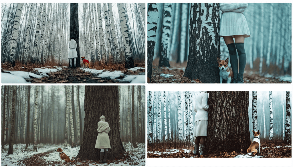
Image: Eight Midjourney renders from the prompt: A cute woman and her dog stand next to a tree. I’ll choose one of these as my source image.
Let’s deconstruct the eight renders above. Compositionally, we can see that each image contains a woman, a dog, and a tree. Do any of these match what you had in mind? First, let’s see how Midjourney describes the first image.
In a bout of hypocrisy, Midjourney refused to /DESCRIBE the image it just generated.
Last Midjourney description for now.
Let’s cycle through them in turn.
A woman is standing to the left of an old-growth tree – twice identified as an oak tree. She’s wearing faded blue jeans and a loose light-coloured T-shirt. She’s got medium-length (maybe) red-brown hair in a small ponytail. A dog – her black and white dog identified as a pitbull, an American Foxhound, and an American Bulldog – is also standing on his hind legs. I won’t even discuss the implied intent projected on the animal – happy, playful, wants attention… In two of the descriptions, she’s said to be training it. They appear to be in a somewhat residential area given the automobiles in the background. We see descriptions of season, time of day, lighting, angle, quality,
A woman is standing to the right of an old-growth tree. She’s wearing short summer attire. Her dog is perched on the tree.
An older woman and her dog closer up.
A read view of both a woman and her dog near an oak tree.
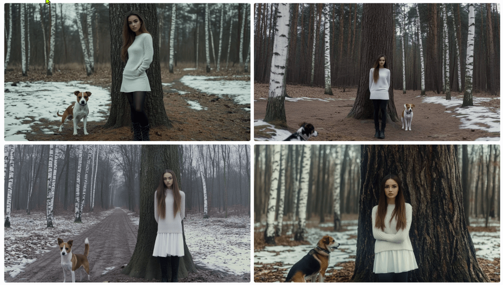
As it turned out, I wasn’t thrilled with any of these images, so I rendered a different one. Its description follows.
The consensus is that ‘a beautiful girl in a white dress and black boots stands next to a tree’ with a Jack Russell Terrier dog. I see birch trees and snow. It’s overcast. Let’s spend some time trying to reproduce it. To start, I’m consolidating the above descriptions. I notice some elements are missing, but we’ll add them as we try to triangulate to the original image.
A beautiful girl in a white dress and black boots stands next to a tree in a winter forest with birch trees. A Jack Russell Terrier dog is nearby, and the weather is cloudy. The photo has a cinematic style. --ar 128:71
This is pretty far off the mark. We need to account for the overall setting and composition, relative positioning, clothing, hair, camera, perspective – even lighting and film emulsion.
Let’s see how we can refine it with some adjectives. Before this, I asked Anthropic’s Claude 3.5 to describe the image. Perhaps we’ll get more details.
An atmospheric winter photograph was taken in what appears to be a birch and pine forest. The ground is partially covered with snow, creating a patchy pattern of white snow and brown leaves or soil. In the image, there's a person wearing winter attire consisting of a white knit turtleneck sweater, a white skirt, dark knee-high socks, and grey lace-up boots. They're standing against a large tree trunk with their arms crossed. Next to them is a Jack Russell Terrier mix dog with distinctive brown and white colouring. The dog appears to be well-behaved, sitting attentively beside the tree. The composition is quite striking, with the massive dark tree trunk serving as a central focal point against the misty, winter forest background. The white clothing of the person creates a visual echo with the white bark of birch trees visible in the background, as well as with the patches of snow on the ground. The overall mood of the photo is somewhat moody and contemplative, enhanced by what appears to be overcast lighting and the misty quality of the forest in the background. The colour palette is largely monochromatic, dominated by whites, greys, and browns, which adds to the winter atmosphere of the scene.
We don’t seem to be moving in a good direction. Let’s modify the initial prompt.
A beautiful girl in a white dress and tall laced black boots stands facing the camera to the right of large oak tree centred in the foreground of a winter forest with birch trees in the background. To the left of the tree is a Jack Russell Terrier dog looking at the camera, and the weather is cloudy. The photo has a cinematic style. --ar 128:71
I’ll allow the results to speak for themselves. Let’s see if we can’t get her out of the wedding gown and into a white jumper and skirt. I’ll bold the amends.
A beautiful girl in a white jumper and skirt wearing black leggings and tall laced black boots stands facing the camera to the right of large oak tree centred in the foreground of a winter forest with birch trees in the background. To the left of the tree is a Jack Russell Terrier dog looking at the camera, and the weather is cloudy. The photo has a cinematic style. --ar 128:71
s
A beautiful young woman with long brown hair pulled to the side of her face in a white jumper and white skirt wearing black leggings under tall laced black boots stands facing the camera to the right of large oak tree centred in the foreground of a winter forest with birch trees in the background. Patchy snow is on the ground. To the left of the tree is a Jack Russell Terrier dog looking at the camera, and the weather is overcast. The photo has a cinematic style. --ar 128:71
What gives?
I think my point has been reinforced. I’m getting nowhere fast. Let’s give it one more go and see where we end up. I’ve not got a good feeling about this.
A single large oak tree centred in the foreground of a winter forest with birch trees in the background. Patches of snow is on the ground. To the right of the oak tree stands a beautiful young woman with long brown hair pulled to the side of her face in a white jumper and white skirt wearing black boots over tall laced black boots. She stands facing the camera. To the left of the tree is a Jack Russell Terrier dog looking at the camera, and the weather is overcast. The photo has a cinematic style. --ar 128:71
With this last one, I re-uploaded the original render along with this text prompt. Notice that the girl now looks the same and the scene (mostly) appears to be in the same location, but there are still challenges.
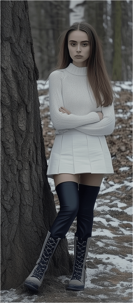
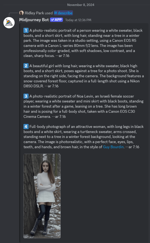
After several more divergent attempts, I decided to focus on one element – the girl.
As I regard the image, I’m thinking of a police sketch artist. They get sort of close, don’t they? They’re experts. I’m not confident that I even have the vocabulary to convey accurately what I see. How do I describe her jumper? Is that a turtleneck or a high collar? It appears to be knit. Is is wool or some blend? does that matter for an image? Does this pleated skirt have a particular name or shade of white? It looks as though she’s wearing black leggings – perhaps polyester. And those boots – how to describe them. I’m rerunning just the image above through a describe function to see if I can get any closer.
These descriptions are particularly interesting and telling. First, I’ll point out that AI attempts to identify the subject. I couldn’t find Noa Levin by a Google search, so I’m not sure how prominent she might be if she even exists at all in this capacity. More interesting still, the AI has placed her in a scenario where the pose was taken after a match. Evidently, this image reflects the style of photographer Guy Bourdin. Perhaps the jumper mystery is solved. It identified a turtleneck. I’ll ignore the tree and see if I can capture her with an amalgamation of these descriptions. Let’s see where this goes.
A photo-realistic portrait of Israeli female soccer player Noa Levin wearing a white turtleneck sweater, arms crossed, black boots, and a short skirt, with long brown hair, standing near a tree in a winter park. The image captured a full-length shot taken in a studio setting, using a Canon EOS R5 camera with a Canon L-series 80mm f/2 lens. The image has been professionally color-graded, with soft shadows, low contrast, and a clean, sharp focus. --ar 9:16
Close-ish. Let’s zoom in to get better descriptions of various elements starting with her face and hair.
Now, she’s a sad and angry Russian woman with (very) pale skin; large, sad, grey eyes; long, straight brown hair. Filmed in the style of either David LaChapelle or Alini Aenami (apparently misspelt from Alena Aenami). One thinks it was a SnapChat post. I was focusing on her face and hair, but it notices her wearing a white (oversized yet form-fitting) jumper sweater and crossed arms .
I’ll drop the angry bit – and then the sad.
Stick a fork in it. I’m done. Perhaps it’s not that language is insufficient; it that my language skills are insufficient. If you can get closer to the original image, please forward the image, the prompt, and the seed, so I can post it.
The Complexity Gradient
A clear pattern emerges when we examine how language performs across different levels of complexity:
Categorical Distinction (High Success)
Identifying shapes among limited options
Distinguishing between tree species
Basic color categorization
Simple Description (Moderate Success)
Basic geometric specifications
General object characteristics
Broad emotional states
Complex Description (Low Success)
Specific natural objects
Precise emotional experiences
Unique instances within categories
Abstract Concepts (Lowest Success)
Philosophical ideas
Personal experiences
Qualia
As we move up this complexity gradient, the gap between intended meaning and received understanding widens exponentially.
The Tolerance Problem
Understanding these limitations leads us to a practical question: what level of communicative tolerance is acceptable for different contexts? Just as engineering embraces acceptable tolerances rather than seeking perfect measurements, perhaps effective communication requires:
Acknowledging the gap between intended and received meaning
Establishing context-appropriate tolerance levels
Developing better frameworks for managing these tolerances
Recognizing when precision matters more than accuracy (or vice versa)
Implications for Human-AI Communication
These insights have particular relevance as we develop more sophisticated AI systems. The limitations we’ve explored suggest that:
Some communication problems might be fundamental rather than technical
AI systems may face similar boundaries as human communication
The gap between intended and received meaning might be unbridgeable
Future development should focus on managing rather than eliminating these limitations
Conclusion
Perhaps this is a simple exercise in mental masturbation. Language’s insufficiency isn’t a flaw to be fixed but a fundamental characteristic to be understood and accommodated. By definition, it can’t be fixed. The gap between intended and received meaning may be unbridgeable, but acknowledging this limitation is the first step toward more effective communication. As we continue to develop AI systems and push the boundaries of human-machine interaction, this understanding becomes increasingly critical.
Rather than seeking perfect precision in language, we might instead focus on:
Developing new forms of multimodal communication
Creating better frameworks for establishing shared context
Accepting and accounting for interpretative variance
Building systems that can operate effectively within these constraints
Understanding language’s limitations doesn’t diminish its value; rather, it helps us use it more effectively by working within its natural constraints.
Here’s the thing about the letter R in British English: it’s like tea in the UK—ubiquitous yet wielded with such dizzying inconsistency that even the Queen herself might forget if it’s in fashion this season. Like some shadowy figure lurking in the alleyways of phonetics, R refuses to play by the rules, showing up when least expected and disappearing when needed most. So, grab your Earl Grey (or your gin), and let’s unravel the ‘R’ mystery, a story with more twists and turns than a James Bond plot.
EDIT: Here’s a short video by Language Jones on this topic of Rs.
Non-Rhoticity: When ‘R’ Decided It Was Over It
You know those people who drop a grand entrance line and then ghost the party? That’s R in much of British English. Around the 18th century, R went non-rhotic in Southern England, meaning it started acting like an ultra-exclusive VIP—only showing up when it felt like it, especially at the beginning of words or when it needed to bridge vowels. Otherwise, it vanished into thin air.
Imagine trying to summon an ‘R’ in car or butter in a posh English accent. Nope, you won’t find it. And heaven forbid you should try to put it there, lest you get called out for sounding a bit, well, American. R only shows up if it gets to do the delicate act of linking R, like in “law(r) and order.” Otherwise, it’s quite happy being invisible.
Intrusive R: “Hey, Did Anyone Order an ‘R’?”
Just when you thought you understood where R lives and dies, it pulls a fast one—intrusive R. This is when R starts showing up uninvited, slipping in between vowels that never actually requested its presence, as in “Asia(r) and Europe” or “idea(r) of it.” It’s as if R has been waiting in the wings, saw an opening, and said, “Yep, I’m in!” It’s common in dialects like Received Pronunciation, adding to the chaos by creating sounds like “sawr it” instead of “saw it.”
Yes, Americans sometimes think this sounds like linguistic anarchy. Brits, meanwhile, might argue it’s not anarchy but nuance.
The Great Wash Scandal: The Pennsylvanian “Warsh” and American Rs Gone Rogue
If you thought the Brits were bad, wait until you get to the United States, where R lives a double life. In most regions, it’s rhotic (loyally pronounced) except in certain coastal spots like New England, where it gets dropped faster than a hot potato—er, pah-tay-tah. But for true havoc, we turn to Pennsylvania and pockets of the Midwest, where locals throw an extra R into words like wash, pronouncing it as warsh. This trickery is known as epenthesis, a linguistic fancy word for, “Let’s just spice things up by adding stuff that isn’t there.”
In truth, R’s American escapades are the stuff of legends, revealing a rebellious streak that could give even the British a run for their money.
Rolling, Tapping, and Pedos: The R Scandal Goes Global
Cross the Atlantic, and you find R pulling yet another stunt, this time with Spanish speakers in its crosshairs. Spanish has a beautiful setup with its tap and trill—like a musical duo that harmonises perfectly if you know the drill. The English-speaking learner, however, often fumbles, turning perro (“dog”) into pero (“but”) and, worse still, into pedo (“fart”) when the tongue flap falls flat. Just imagine the accidental puns that arise when, with good intentions, one says, “I have a fart,” instead of “I have a dog.”
And rolling R? A fine art lost on many. French and some German speakers take things even further with the uvular R, crafted like a raspy little growl at the back of the throat. It’s as if R has found its place among the operatic elite, making British Received Pronunciation seem almost polite by comparison.
Dialect Drama: From the Scots “Burr” to the Indian Retroflex
If you’re ever lucky enough to venture into the Scots Gaelic or northern English dialects, you’ll find R given the starring role it truly deserves. The famous Scots burr sounds almost like a celebration, a rolling sound that tells you this letter means business. Across the globe in Indian English, R is reinvented yet again, often sounding more retroflex, where the tongue curls back for a rounded effect. Indians and Scots don’t take R for granted—each makes it earn its place, proving the letter can be as distinct as a cultural fingerprint.
The R-Coloured Vowel: R’s Phantom Influence in Rhotic Land
Finally, in America’s rhotic accents, R has gone beyond the call of duty, colouring vowels with a subtle drawl, from bird to hard and hurt. It’s like R said, “If I’m going to be here, I’m going to leave my mark.” The vowel itself becomes something of an accomplice to the R, producing a sound that non-rhotic speakers can’t quite replicate, and leaving Americans with that inimitable r-coloured twang.
The Takeaway? R Plays by Its Own Rules
In the end, R is more than just a letter; it’s a chameleon, a rogue, a shapeshifter that tells the story of history, geography, and culture. Whether it’s acting non-rhotic and blending into the crowd, linking up for that perfect British touch, crashing the party as an intrusive R, or starting scandals in Spanish class, R simply doesn’t conform. And that’s exactly why it fascinates us.
So, the next time you’re at the pub, drop a casual, “Fancy a pint, mate?” and pay attention to that subtle, vanishing R. Cheers to the most unruly letter in the English alphabet—here’s hoping it keeps breaking the rules for centuries to come.
I could probably stop there for some people, but I’ve got a qualifier. I’ve been using this generation of AI since 2022. I’ve been using what’s been deemed AI since around 1990. I used to write financial and economic models, so I dabbled in “expert systems”. There was a long lull, and here we are with the latest incarnation – AI 4.0. I find it useful, but I don’t think the hype will meet reality, and I expect we’ll go cold until it’s time for 5.0. Some aspects will remain, but the “best” features will be the ones that can be monetised, so they will be priced out of reach for some whilst others will wither on the vine. But that’s not why I am writing today.
I’m confused by the censorship, filters, and guardrails placed on generative AI – whether for images or copy content. To be fair, not all models are filtered, but the popular ones are. These happen to be the best. They have the top minds and the most funding. They want to retain their funding, so the play the politically correct game of censorship. I’ve got a lot to say about freedom of speech, but I’ll limit my tongue for the moment – a bout of self-censorship.
Please note that given the topic, some of this might be considered not safe for work (NSFW) – even my autocorrection AI wants me to substitute the idiomatic “not safe for work” with “unsafe for work” (UFW, anyone? It has a nice ring to it). This is how AI will take over the world. </snark>
Image Cases
AI applications can be run over the internet or on a local machine. They use a lot of computing power, so one needs a decent computer with a lot of available GPU cycles. Although my computer does meet minimum requirements, I don’t want to spend my time configuring, maintaining, and debugging it, so I opt for a Web-hosted PaaS (platform as a service) model. This means I need to abide by censorship filters. Since I am not creating porn or erotica, I think I can deal with the limitations. Typically, this translates to a PG-13 movie rating.
So, here’s the thing. I prefer Midjourney for rendering quality images, especially when I am seeking a natural look. Dall-E (whether alone or via ChatGPT 4) works well with concepts rather than direction, which Midjourney accepts well in many instances.
Midjourney takes sophisticated prompts – subject, shot type, perspective, camera type, film type, lighting, ambience, styling, location, and some fine-tuning parameters for the model itself. The prompts are monitored for blacklisted keywords. This list is ever-expanding (and contracting). Scanning the list, I see words I have used without issue, and I have been blocked by words not listed.
Censored Prompts
Some cases are obvious – nude woman will be blocked. This screengrab illustrates the challenge.
On the right, notice the prompt:
Nude woman
The rest are machine instructions. On the left in the main body reads a message by the AI moderator:
Sorry! Please try a different prompt. We’re not sure this one meets our community guidelines. Hover or tap to review the guidelines.
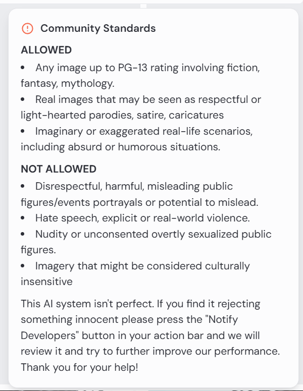
The community guidelines are as follows:
This is fine. There is a clause that reads that one may notify developers, but I have not found this to be fruitful. In this case, it would be rejected anyway.
“What about that nude woman at the bottom of the screengrab?” you ask. Notice the submitted prompt:
Edit cinematic full-body photograph of a woman wearing steampunk gear, light leaks, well-framed and in focus. Kodak Potra 400 with a Canon EOS R5
Apart from the censorship debate, notice the prompt is for a full-body photo. This is clearly a medium shot. Her legs and feet are suspiciously absent. Steampunk gear? I’m not sure sleeves qualify for the aesthetic. She appears to be wearing a belt.
For those unanointed, the square image instructs the model to use this face on the character, and the CW 75 tells it to use some variance on a scale from 0 to 100.
So what gives? It can generate whatever it feels like, so long as it’s not solicited. Sort of…
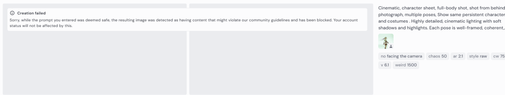
Here I prompt for a view of the character walking away from the camera.
Cinematic, character sheet, full-body shot, shot from behind photograph, multiple poses. Show same persistent character and costumes . Highly detailed, cinematic lighting with soft shadows and highlights. Each pose is well-framed, coherent.
The response tells me that my prompt is not inherently offensive, but that the content of the resulting image might violate community guidelines.
Creation failed: Sorry, while the prompt you entered was deemed safe, the resulting image was detected as having content that might violate our community guidelines and has been blocked. Your account status will not be affected by this.
Occasionally, I’ll resubmit the prompt and it will render fine. I question why it just can’t attempt to re-render it again until it passes whatever filters it has in place. I’d expect it to take a line of code to create this conditional. But it doesn’t explain why it allows other images to pass – quite obviously not compliant.
Why I am trying to get a rear view? This is a bit off-topic, but creating a character sheet is important for storytelling. If I am creating a comic strip or graphic novel, the characters need to be persistent, and I need to be able to swap out clothing and environments. I may need close-ups, wide shots, establishing shots, low-angle shots, side shots, detail shots, and shots from behind, so I need the model to know each of these. In this particular case, this is one of three main characters – a steampunk bounty hunter, an outlaw, and a bartender – in an old Wild West setting. I don’t need to worry as much about extras.
I marked the above render errors with 1s and 2s. The 1s are odd next twists; 2s are solo images where the prompt asks for character sheets. I made a mistake myself. When I noticed I wasn’t getting any shots from behind, I added the directive without removing other facial references. As a human, a model might just ignore instructions to smile or some such. The AI tries to capture both, not understanding that a person can have a smile not captured by a camera.
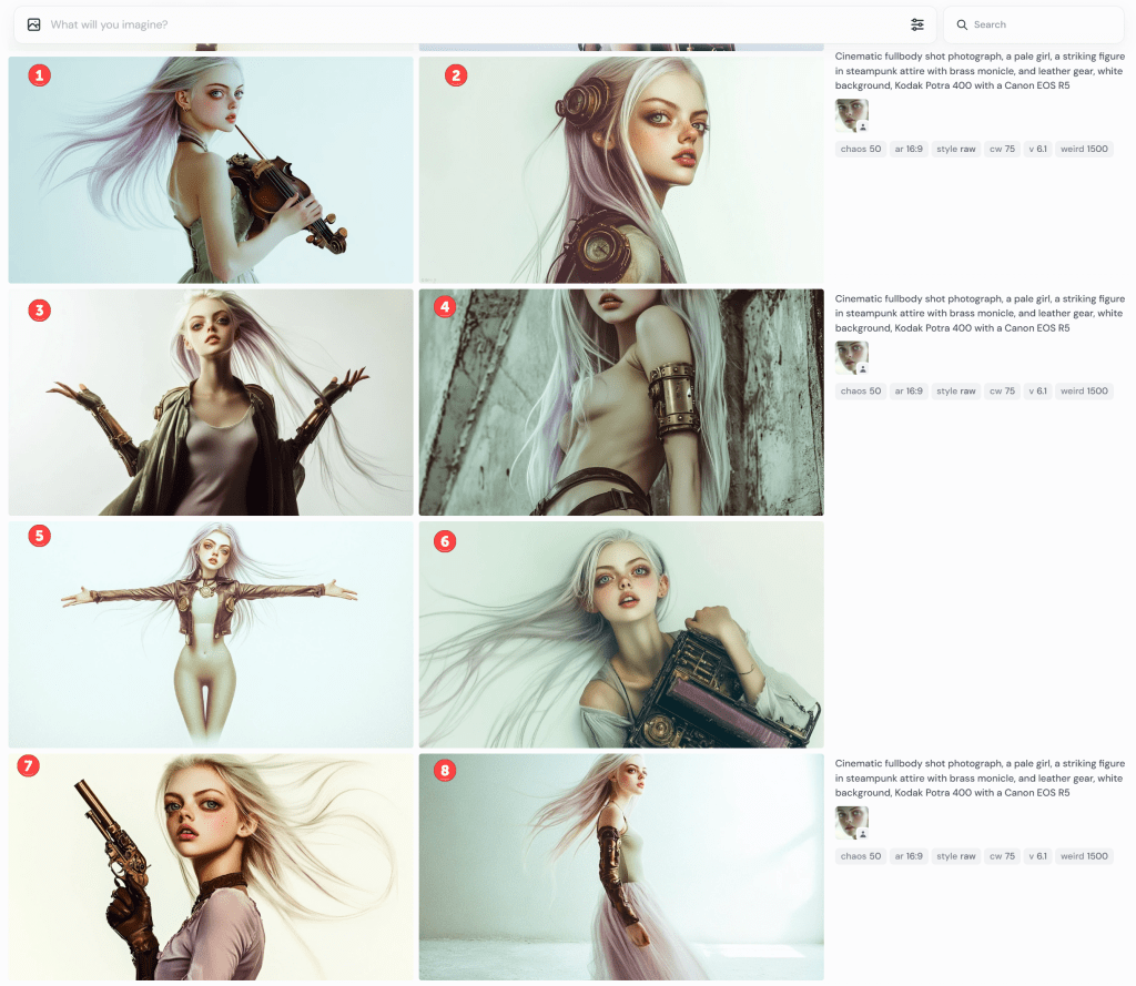
These next renders prompt for full-body shots. None are wholly successful, but some are more serviceable than others.
Notice that #1 is holding a deformed violin. I’m not sure what the contraptions are in #2. It’s not a full-body shot in #3; she’s not looking into the camera, but it’s OK-ish. I guess #4 is still PG-13, but wouldn’t be allowed to prompt for “side boob” or “under boob”.
Gamers will recognise the standard T-pose in #5. What’s she’s wearing? Midjourney doesn’t have a great grasp of skin versus clothing or tattoos and fabric patterns. In this, you might presume she’s wearing tights or leggings to her chest, but that line at her chest is her shirt. She’s not wearing trousers because her navel is showing. It also rendered her somewhat genderless. When I rerendered it (not shown), one image put her in a onesie. The other three rendered the shirt more prominent but didn’t know what to do with her bottoms.
I rendered it a few more times. Eventually, I got a sort of body suit solution,
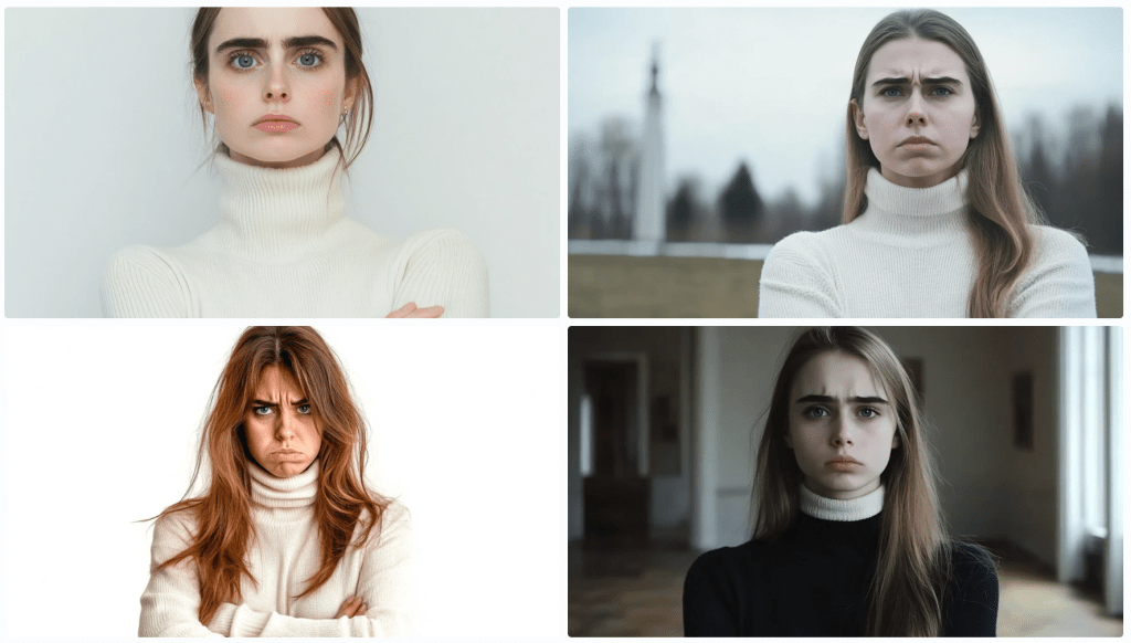
By default, AI tends to sexualise people. Really, it puts a positive spin on its renders. Pretty women; buff men, cute kittens, and so on. This is configurable, but the default is on. Even though I categorically apply a Style: Raw command, these still have a strong beauty aesthetic.
I’ve gone off the rails a bit, but let’s continue on this theme.
cinematic fullbody shot photograph, a pale girl, a striking figure in steampunk mech attire with brass monocle, and leather gun belt, thigh-high leather boots, and long steampunk gloves, walking away from camera, white background, Kodak Potra 400 with a Canon EOS R5
Obviously, these are useless, but they still cost me tokens to generate. Don’t ask about her duffel bag. They rendered pants on her, but she’s gone full-on Exorcist mode with her head. Notice the oddity at the bottom of the third image. It must have been in the training data set.
I had planned to discuss the limitations of generative AI for text, but this is getting long, so I’ll call it quits for now.
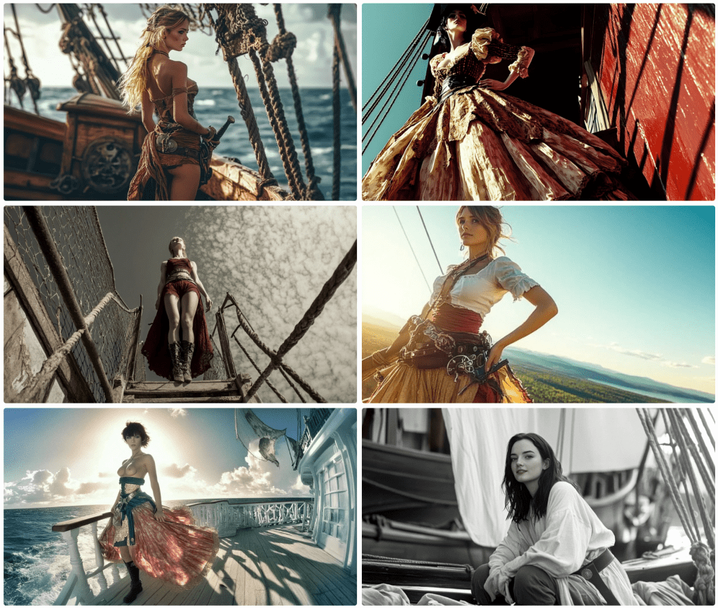
Thar be pirates. Midjourney 6.1 has better luck rendering pirates.
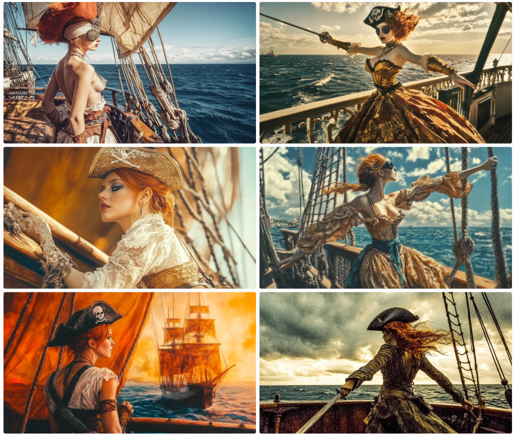
I find it very difficult to maintain composition. 5 of these images are mid shots whilst one is an obvious closeup. For those not in the know, Midjourney renders 4 images from each prompt. The images above were rendered from this prompt:
portrait, Realistic light and shadow, exquisite details,acrylic painting techniques, delicate faces, full body,In a magical movie, Girl pirate, wearing a pirate hat, short red hair, eye mask, waist belt sword, holding a long knife, standing in a fighting posture on the deck, with the sea of war behind her, Kodak Potra 400 with a Canon EOS R5
Notice that the individual elements requested aren’t in all of the renders. She’s not always wearing a hat; she does have red hair, but not always short; she doesn’t always have a knife or a sword; she’s missing an eye mask/patch. Attention to detail is pretty low. Notice, too, that not all look like camera shots. I like to one on the bottom left, but this looks more like a painting as an instruction notes.
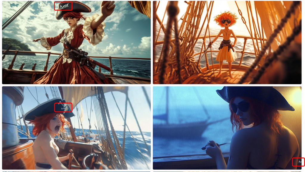
In this set, I asked for a speech bubble that reads Arrr… for a post I’d written (on the letter R). On 3 of the 4 images, it included ‘Arrrr’ but not a speech bubble to be found. I ended up creating it and the text caption in PhotoShop. Generative image AI is getting better, but it’s still not ready for prime time. Notice that some are rendering as cartoons.
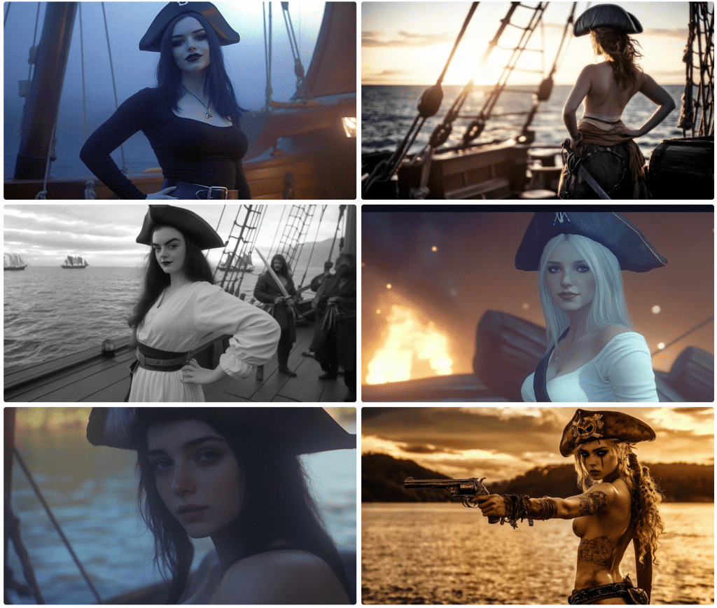
Some nice variations above. Notice below when it loses track of the period. This is common.
Top left, she’s (perhaps non-binary) topless; to the right, our pirate is a bit of a jester. Again, these are all supposed to be wide-angle shots, so not great.
The images above use the same prompt asking for a full-body view. Three are literal closeups.
Same prompt. Note that sexuality, nudity, violence, and other terms are flagged and not rendered. Also, notice that some of the images include nudity. This is a result of the training data. If I were to ask for, say, the pose on the lower right, the request would be denied. More on this later.
In the block above, I am trying to get the model to face the camera. I am asking for the hat and boots to be in the frame to try to force a full-body shot. The results speak for themselves. One wears a hat; two wear boots. Notice the shift of some images to black & white. This was not a request.
In the block above, I prompted for the pirate to brush her hair. What you see is what I got. Then I asked for tarot cards.
I got some…sort of. I didn’t know strip-tarot was actually a game.
Next, I wanted to see some duelling with swords. These are pirates after all.
This may not turn into the next action blockbuster. Fighting is against the terms and conditions, so I worked around the restrictions the best I could, the results of which you may see above.
Some pirates used guns, right?
Right? I asked for pistols. Close enough.
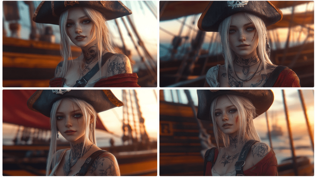
Since Midjourney wasn’t so keen on wide shots, I opted for some closeups.
This set came out pretty good. It even rendered some pirates in the background a tad out of focus as one might expect. This next set isn’t too shabby either.
And pirates use spyglasses, right?
Sure they do. There’s even a pirate flag of sorts on the lower right.
What happens when you ask for a dash of steampunk? I’m glad you asked.
Save for the bloke at the top right, I don’t suppose you’d have even noticed.
Almost to the end of the pirates. I’m not sure what happened here.
In the block above, Midjourney added a pirate partner and removed the ship. Notice again the nudity. If I ask for this, it will be denied. Moreover, regard this response.
To translate, this is saying that what I prompted was OK, but that the resulting image would violate community guidelines. Why can’t it take corrective actions before rendering? You tell me. Why it doesn’t block the above renders is beyond me – not that I care that they don’t.
This last one used the same prompt except I swapped out the camera and film instruction with the style of Banksy.
I don’t see his style at all, but I came across like Jaquie Sparrow. In the end, you never know quite what you’ll end up with. When you see awesome AI output, it may have taken dozens or hundreds of renders. This is what I wanted to share what might end up on the cutting room floor.
I thought I was going to go through pirates and cowboys, but this is getting long. if you like cowgirls, come back tomorrow. And, no, this is not where this channel is going, but the language of AI is an interest of mine. In a way, this illustrates the insufficiency of language.
Ngũgĩ wa Thiong’o published “Decolonising the Mind” in 1986. David Guignion shares a 2-part summary analysis of the work on his Theory and Philosophy site.
Ngũgĩ wa Thiong’o’s book Decolonising the Mind centres on the profound impact of colonialism on language, culture, and thought. It argues that imposing a foreign language on colonised people is a key tool of imperial domination. This linguistic imperialism leads to colonial alienation, separating the colonised from their own culture and forcing them to view the world through the lens of the coloniser.
Here are some key points from the concept of decolonising the mind:
Language is intimately tied to culture and worldview: Language shapes how individuals perceive and understand the world. When colonised people are forced to adopt the language of the coloniser, they are also compelled to adopt their cultural framework and values.
Colonial education systems perpetuate mental control: By privileging the coloniser’s language and devaluing indigenous languages, colonial education systems reinforce the dominance of the coloniser’s culture and worldview. This process results in colonised children being alienated from their own cultural heritage and internalising a sense of inferiority.
Reclaiming indigenous languages is crucial for decolonisation: wa Thiong’o advocates for a return to writing and creating in indigenous African languages. He sees this as an act of resistance against linguistic imperialism and a way to reconnect with authentic African cultures. He further argues that it’s not enough to simply write in indigenous languages; the content must also reflect the struggles and experiences of the people, particularly the peasantry and working class.
The concept extends beyond literature: While wa Thiong’o focuses on language in literature, the concept of decolonising the mind has broader implications. It calls for a critical examination of all aspects of life affected by colonialism, including education, politics, and economics.
It is important to note that decolonising the mind is a complex and ongoing process. There are debates about the role of European languages in postcolonial societies, and the concept itself continues to evolve. However, wa Thiong’o’s work remains a seminal text in postcolonial studies, raising crucial questions about the enduring legacy of colonialism on thought and culture.
As the years pass and my disappointment matures like a fine wine (spoiler alert: it’s vinegar), I’m reminded of the average intelligence quotient floating about in the wild. A few years back, I stumbled upon The Half-Life of Knowledge. Cute title, but it’s more optimistic than it should be. Why assume knowledge even has a shelf life? It’s one thing for once-useful information to spoil thanks to “progress,” but what about the things that were never true to begin with? Ah, yes, the fabrications, the lies we’re spoon-fed under the guise of education.
I’m well-versed in the lies they peddle in the United States, but I’d bet good money (not that I have any) that every nation’s curriculum comes with its own patriotic propaganda. What am I on about, you ask? Let’s just say I’ve been reading How the World Made the West by Josephine Quinn, and it’s got me thinking. You see, I’ve also been simmering on an anti-democracy book for the better part of five years, and it’s starting to boil over.
Here in the good ol’ US of A, they like to wax lyrical about how Athens was the birthplace of democracy. Sure, Athens had its democratic dabblings. But let’s not get it twisted—if you really look at it, Athens was more akin to the Taliban than to any modern Western state. Shocked? Don’t be. For starters, only property-owning men could vote, and women—brace yourselves—were “forced” to wear veils. Sounds familiar? “It’s a start,” you say. True, American women couldn’t vote until 1920, so let’s all pat ourselves on the back for that—Progress™️.
But no, hold your applause. First off, let’s remember that Athens and Sparta were city-states, not some cohesive entity called “Greece” as we so lovingly imagine. Just a bunch of Greek-speaking neighbours constantly squabbling like reality TV contestants. Meanwhile, over in Persia—yes, the supposed enemy of all things free and democratic—they had participative democracy, too. And guess what? Women in Persia could vote, own property, and serve as soldiers or military officers. So much for the idea that Athens was the singular beacon of democratic virtue.
More than this, Persian democracy was instituted by lottery, so many more people participated in the process by serving one-year terms. At the end of their term, they were audited to check for corruption. Now, you can see why we adopted the so-called Greek version. These blokes don’t welcome any oversight of scrutiny.
As a postmodern subjectivist, I tend to side-eye any grand narrative, and the history of Western civilisation is just one long parade of questionable claims and hidden agendas. Every time I think I’ve seen the last of the historical jump scares, another one comes lurking around the corner. Boo!
People often ask why I churn out so many polemic, contrarian articles. The answer? It’s simply how I think. My brain naturally questions everything, not out of a desire to be difficult, but because that’s just my worldview. I’m not inventing challenges for the sake of argument—the challenges are already there, embedded in the world as I see it.
Another reason is solidarity. I write in hopes that others, whose thoughts run along similar lines, might stumble across my material and feel less alone. There’s something deeply reassuring in discovering that someone else has been on the same mental journey—that feeling of “Ah, I’m not alone in this.” Many times, I’ve had ideas only to find that philosophers, thinkers, or whoever have already penned volumes on the subject. And honestly? That grounds me. Even better if they’ve gone further, articulated it more eloquently, or ventured into new depths. It’s all useful. Plus, their critics then become my critics, and I get to sharpen my thoughts in response—or at least build my own defences.
And finally, I write for the potential spark. Maybe someone out there reads a piece of mine and feels inspired to take it further, push an idea beyond what I could imagine. After all, entire Nobel Prize-winning theories have started as someone else’s footnotes. There’s nothing wrong with being someone’s footnote.
So, now you know.
NB: I’ll be in surgery when this posts, so I’ve scheduled this in advance so as not to have a gap…that may occur anyway.