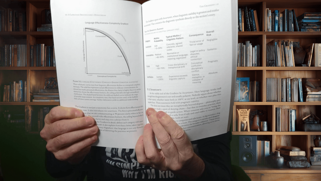
It’s finally arrived, and now I have to review it.
I’ve published books before. In fact, this one is number nine – cue the Beatles’ White Album. I was nervous as I released my first fiction as Ridley Park, and I released three more before I released my first nonfiction as myself. But this one means the most to me.
Audio: NotebookLM summary podcast of this content – sort of.
I am well aware that artists tend to say that about each piece of work as it is born into the world, but this one actually started before any of the other ones. About a year ago, it had twice as many pages, and I’ve been whittling it down to 132 pages. At the same time, I am trying to cut the fat, new meat appears, and I have to decide how to treat it. In this social media world, I can instantiate some of it through this lens. At some point, I may publish a second edition. I may even produce a version that incorporates several of my ideas with connective tissue.
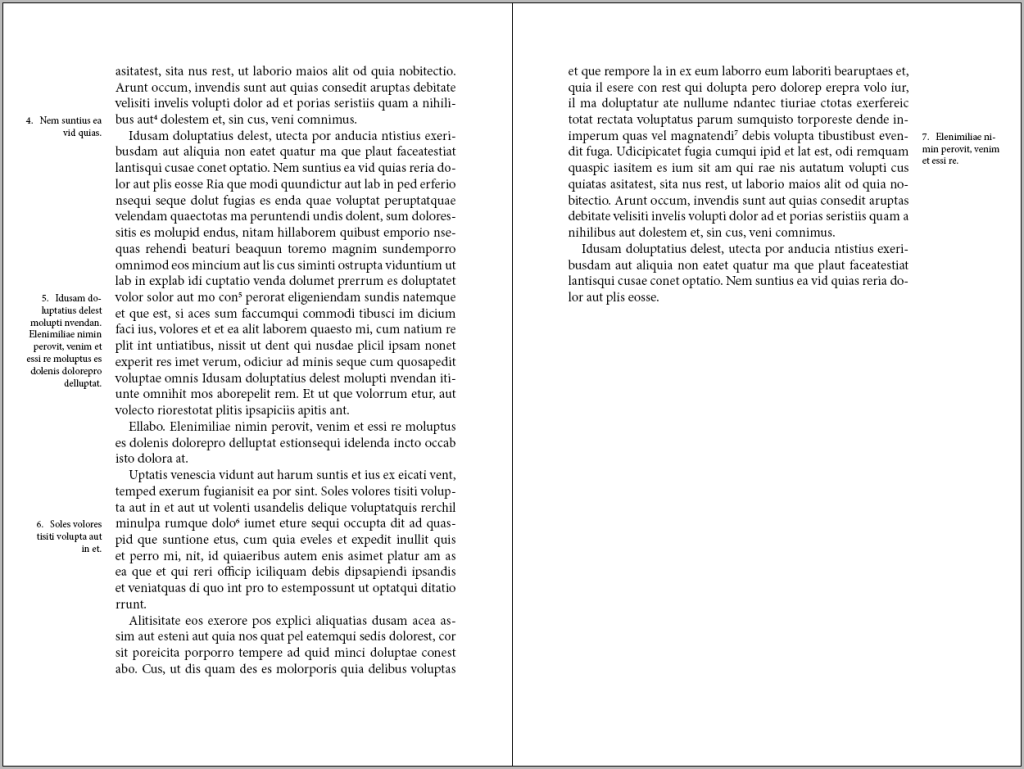
My near-term goal is to review this page-by-page for mistakes – misstatements – and to see how it lays out on the page. Obviously, I produce my work on a computer – a PC. I tend to write in Microsoft Word and format in InDesign. I output to PDF, as required by printers. Although I print pages for review, there is still something different about a physical, bound book. I’ve even printed it in a folded booklet style, which gets mostly there, but it’s still deficient.
This is an announcement, not a promotion. I’m not trying to pad out an entry, but I wanted to share. I’ll end here.
Well, not so much hard as not particularly or inherently enjoyable.
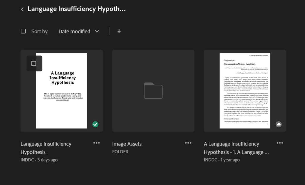
I estimate I’ve got about a day left to complete this manuscript – ‘done’ done. When I open InDesign, it shames me – 3 days ago, I last touched this document. It doesn’t feel like 3 days have passed, but time flies.
On the right is an older version. I began reworking it into this new version over the summer, and here I am come autumn. It’s even worse if I use the Chinese calendar. Evidently, 7th November is the first day of winter. They can’t wait until soltace.
Anyway, just a brief update. This isn’t going to edit itself, and I can’t afford to pay an editor for a passion project. Besides – and let’s be honest – I can’t afford an editor in general – or at least can’t cost-justify it – and all my writing is a passion project.
Of course, editors (and cover artists) insist that one would sell more book if only they were edited or professionally rendered. There is an element of truth to this, but I’ve read some gawdawful books that were professionally edited and published through a traditional publisher, because publishers publish.
Me, I operate on razor-thin margins. Most of my publications haven’t even broken even – even if I ignore opportunity costs, which I can’t because I’m an economist. Accountants get to play that trick.
This said, I do hire reviewers, editors, and artists in small doses – homoeopathic as they might be – and I’ve had mixed results.
I’m rambling
Must really be avoiding the editing process…
Recently, I wanted to redesign the cover of one of my Ridley Park fiction books.
Image Comparison: A Tale of Two Propensities
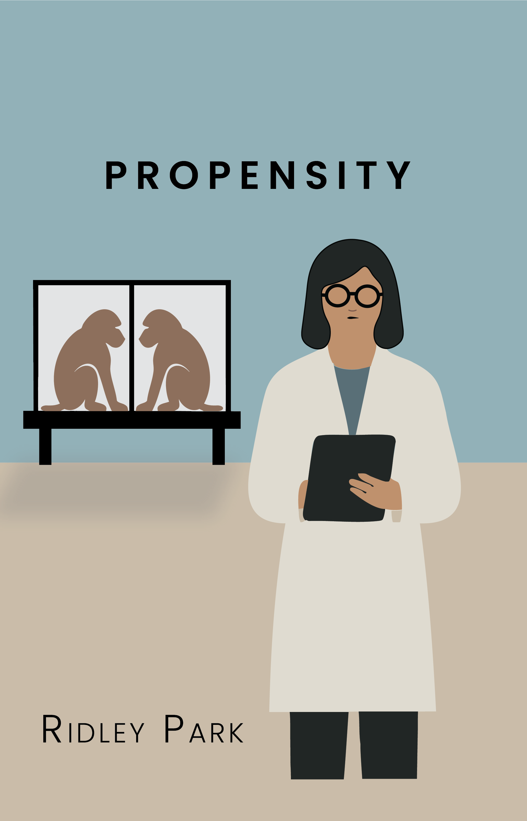
The cover on the left is the original. It is intentionally a minimal 2-D construction – a representation of the first section of the book, the first 15 chapters.
The cover on the right is the update. It is also minimalist, representing the second section of Propensity. I’m not sure how I would depict the third section. If it comes to me, I may render a third version.
There’s a story to this. I reached out to some cover artists and told them I was unhappy with my original design but had no visual ideas. I’d leave this to the artist. It turns out that some artists don’t want full control over the design process. I can understand the hesitation.
They asked for covers that I might like, so I researched some covers and saved them to a Pinterest board.
As it turned out, after some inspiration, I decided to render this one myself, too. Hey, I tried.
What happened to the rest of the time?
OK, so there’s more. I also created a video book trailer in the evening.
It was fun enough. Give it a watch. It also represents part one of Propensity.
OK, this time for real. Let me know what you think…about anything in particular.
This is the proof copy of The Illusion of Light. I reviewed it, approved it, and signalled ‘good to go’. This is being printed and distributed through KDP. I’ve used them before. They’ve been reliable.
EDIT: On the upside, I’ve been notified that the hardback version is available, but it doesn’t appear to be available in France and Canada, two target regions. Hopefully, it becomes available outside of the U.S. soon.
EDIT : J’ai été informé que la version reliée est désormais disponible. Malheureusement, elle ne semble pas encore l’être en France ni au Canada, les deux régions que je visais en priorité. Espérons qu’elle franchira bientôt les frontières du système et sera distribuée ailleurs qu’aux États-Unis.
International marketplaces. It takes 3-5 business days for your hardcover to show as in stock.
Until now.
My approval triggered a workflow. I know workflows. I used to design them. I also know how dumb they can be.
KDP’s process flagged an error: the text on the spine might not be on the spine. ‘Might’. Theoretically. It could be offset, cut off, or printed on a fold. I understand their reasoning – high-speed printers, mechanical variance, and return risk. I also understand statistics, and a single observation doesn’t make a trend. But anyone with eyes can see at least a couple of millimetres of clearance at the top and bottom. This isn’t a case of ‘maybe’. It’s fine.
What fascinates me here is the ritual of compliance. Once a process is codified, it becomes self-justifying. The rule exists; therefore, it must be obeyed. There is no appeal to reason – only to the flowchart.
In the 1980s, when I was an audio engineer recording to two-inch magnetic tape, some of us liked to record hot, pushing the levels just past the recommended limits. You learned to ride the edge, to court distortion without collapse. That’s how I designed the spine text. Within tolerance. With headroom.
The problem is that modern systems don’t tolerate edges. There’s no “override” button for informed judgment. My remediation path is to shrink the type by half a point, resubmit, and pretend the machine was right.
What’s absurd is the timing. The same system that generated the proof approved this layout days ago. An automated OCR scan could have caught this phantom error earlier. Instead, the machine waits until the human signs off, then throws a flag so the process can justify its existence.
KDP is still faster and saner than IngramSpark. But this is capitalism distilled: survival by being marginally less incompetent than your competitor. Optimisation, not in the sense of best possible, but of barely better than worst acceptable.
The lesson, as always, is that processes begin as aids and end as prisons. The workflow, like the Enlightenment, believes itself rational. But the longer it runs, the less it serves the human at the console and the more it worships its own perfection.
Want to talk about meta? This underscores the contents of the book itself. What the Enlightenment once called Reason, modernity now calls Process. Both pretend to neutral objectivity while enshrining obedience as virtue. The bureaucracy of light has become digital – its catechism written in checkboxes, its priests replaced by automated validators. Every workflow promises fairness; each only codifies submission. The real danger isn’t that machines will replace judgment, but that we will stop noticing when they already have.
The Story Continues: Behind the Scenes
Image: Screenshot of Illustrator layout
I’ve reduced the font size on the spine from 14 points to 13.5. It still technically bleeds over a guideline. I hope I am not forced to reduce it to 13. A reason for text on the spine is to make it visible. Hopefully, the black-and-white vertical separation will help in this regard. Fingers crossed.
I created a “Book Club Edition” of Propensity, a Ridley Park book of fiction primarily for the European market – specifically in the UK – though it’s available elsewhere. I altered the cover art. As an author, I also wanted to compare KDP and IngramSpark as printers and distributors.
I find the cover texture on this version interesting, but I don’t have a word to describe it. I like it. There’s a certain je ne sais quoi about it – the texture. I reworked the art to track the second section of the book. The original cover tracks the first section.
Image: Propensity by Ridley Park; original book cover
At least in this proof version, the black ink is not 100% and is streaky. The KDP version is 100% K and solid black. I mightn’t have noticed except that some section division pages were mostly black, and it is quite evident. I don’t discern a difference in the quality of the text itself.
Illusion of Light
The Illusion of Light is a cloth version of a book also available in paperback. I like the cloth-bound. There is a nostalgic elegance about it. It feels durable – more so than a paperback for sure. I’m not sure about versus the case laminate versions. They come off like textbooks to me – not the vibe I am aiming for.
Ok. I admit this is an expansive claim, but I write about the limitations on generative artificial intelligence relative to writers. I wrote this after encountering several Reddit responses by writers who totally misunderstand how AI works. They won’t read this, but you might want to.
I’m almost finished with A Language Insufficiency Hypothesis, the book I’ve been labouring over for what feels like the gestation period of a particularly reluctant elephant. To be clear: the manuscript is done. Written. Edited. Blessed. But there remains one final circle of publishing hell—the index.
Now, if you’re wondering how motivated I am to return to indexing, consider this: I’m writing this blog post instead. If that doesn’t scream avoidance with an airhorn, nothing will.
Audio: NotebookLM podcast on this topic.
I began indexing over a month ago. I made it through two chapters of eight, then promptly wandered off to write a couple of novellas. As you do. One started as a short story—famous last words—and evolved into a novella. The muse struck again. Another “short story” appeared, and like an unattended sourdough starter, it fermented into a 15,000-word novelette. Apparently, I write short stories the way Americans pour wine: unintentionally generous.
Apparently, I write short stories the way Americans pour wine: unintentionally generous.
With several unpublished manuscripts loitering on my hard drive like unemployed theatre majors, I figured it was time to release one into the wild. So I did. I published the novelette to Kindle, and just today, the paperback proof landed in my postbox like a smug little trophy.
And then, because I’m an unrepentant completionist (or a masochist—jury’s out), I thought: why not release the novella too? I’ve been told novellas and novelettes are unpopular due to “perceived value.” Apparently, people would rather buy a pound of gristle than 200 grams of sirloin. And yet, in the same breath, they claim no one has time for long books anymore. Perhaps these are different tribes of illiterates. I suppose we’ll find out.
Let’s talk logistics. Writing a book is only the beginning—and frankly, it’s the easy part. Fingers to keyboard, ideas to page. Done. I use Word, like most tragically conventional authors. Planning? Minimal. These were short stories, remember? That was the plan.
Next comes layout. Enter Adobe InDesign—because once you’ve seen what Word does to complex layouts, you never go back. Export to PDF, pray to the typographic gods, and move on.
Then there’s the cover. I lean on Illustrator and Photoshop. Photoshop is familiar, like a worn-in shoe; Illustrator is the smug cousin who turns up late but saves the day with scalable vectors. This time, I used Illustrator for the cover—lesson learnt from past pixelation traumas. Hardback to paperback conversion? A breeze when your artwork isn’t made of crayon scribbles and hope.
Covers, in case you’ve never assembled one, are ridiculous. Front. Back. Spine. Optional dust jacket if you’re feeling fancy (I wasn’t). You need titles, subtitles, your name in a legible font, and let’s not forget the barcode, which you will place correctly on the first attempt exactly never.
Unlike my first novel, where I enlisted someone with a proper design eye to handle the cover text, this time I went full minimalist. Think Scandinavian furniture catalogue meets existential despair. Classy.
Once the cover and interior are done, it’s time to wrestle with the publishing platforms. Everything is automated these days—provided you follow their arcane formatting commandments, avoid forbidden fonts, and offer up your soul. Submitting each book takes about an hour, not including the time lost choosing a price that balances “undervalued labour” and “won’t scare away cheapskates.”
Want a Kindle version? That’s another workflow entirely, full of tortured formatting, broken line breaks, and wondering why your chapter headings are now in Wingdings. Audiobooks? That’s a whole other circus, with its own animals and ringmasters. Honestly, it’s no wonder authors hire publishers. Or develop drinking problems.
But I’m stubborn. Which brings us full circle.
I’ve now got two books heading for daylight, a few more waiting in the wings, and one bloody non-fiction beast that won’t see release until I finish the damn index. No pseudonym this time. No hiding. Just me, owning my sins and hoping the final product lands somewhere between “insightful” and “mercifully short.”
So yes, life may well be a journey. But indexing is the bit where the satnav breaks, the road floods, and the boot falls off the car. Give me the destination any day. The journey can fuck right off.