Censorial AI

I’m confused.

I could probably stop there for some people, but I’ve got a qualifier. I’ve been using this generation of AI since 2022. I’ve been using what’s been deemed AI since around 1990. I used to write financial and economic models, so I dabbled in “expert systems”. There was a long lull, and here we are with the latest incarnation – AI 4.0. I find it useful, but I don’t think the hype will meet reality, and I expect we’ll go cold until it’s time for 5.0. Some aspects will remain, but the “best” features will be the ones that can be monetised, so they will be priced out of reach for some whilst others will wither on the vine. But that’s not why I am writing today.

I’m confused by the censorship, filters, and guardrails placed on generative AI – whether for images or copy content. To be fair, not all models are filtered, but the popular ones are. These happen to be the best. They have the top minds and the most funding. They want to retain their funding, so the play the politically correct game of censorship. I’ve got a lot to say about freedom of speech, but I’ll limit my tongue for the moment – a bout of self-censorship.

Please note that given the topic, some of this might be considered not safe for work (NSFW) – even my autocorrection AI wants me to substitute the idiomatic “not safe for work” with “unsafe for work” (UFW, anyone? It has a nice ring to it). This is how AI will take over the world. </snark>

Image Cases

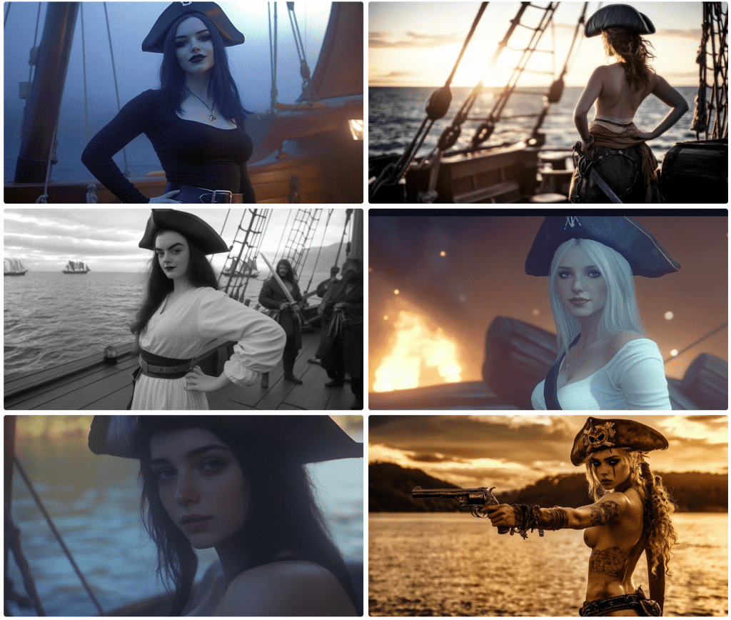
AI applications can be run over the internet or on a local machine. They use a lot of computing power, so one needs a decent computer with a lot of available GPU cycles. Although my computer does meet minimum requirements, I don’t want to spend my time configuring, maintaining, and debugging it, so I opt for a Web-hosted PaaS (platform as a service) model. This means I need to abide by censorship filters. Since I am not creating porn or erotica, I think I can deal with the limitations. Typically, this translates to a PG-13 movie rating.

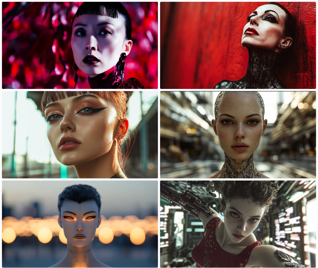
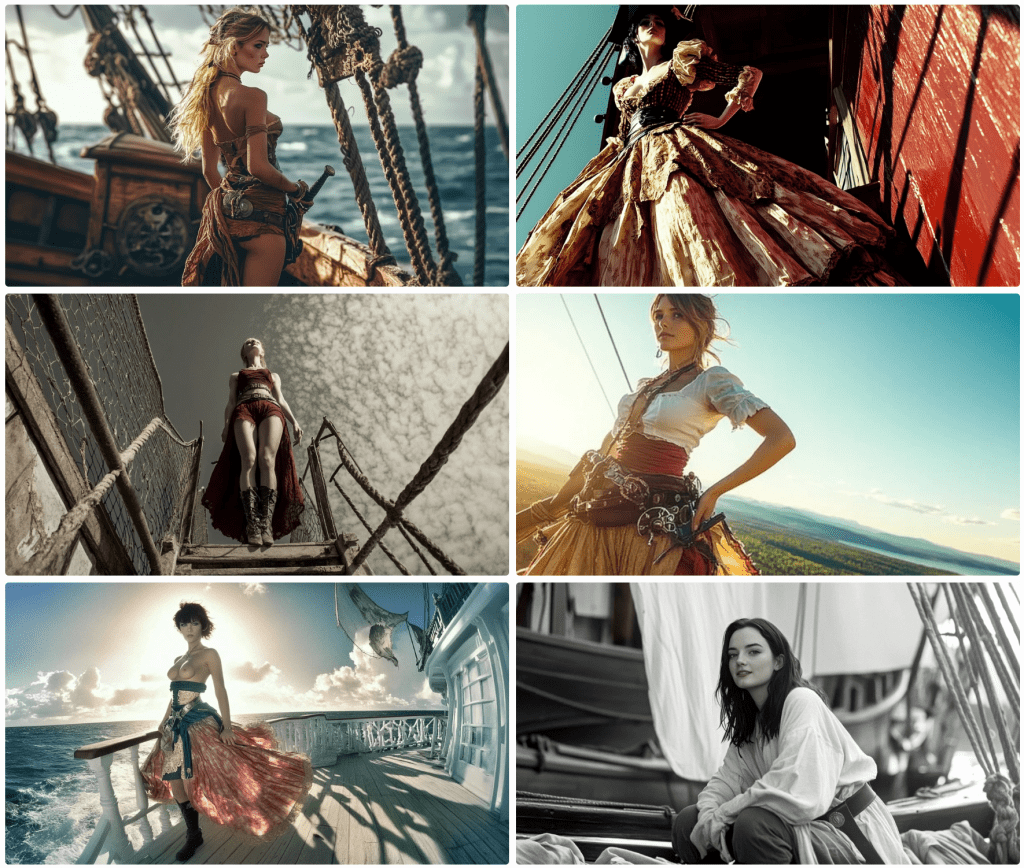
So, here’s the thing. I prefer Midjourney for rendering quality images, especially when I am seeking a natural look. Dall-E (whether alone or via ChatGPT 4) works well with concepts rather than direction, which Midjourney accepts well in many instances.

Midjourney takes sophisticated prompts – subject, shot type, perspective, camera type, film type, lighting, ambience, styling, location, and some fine-tuning parameters for the model itself. The prompts are monitored for blacklisted keywords. This list is ever-expanding (and contracting). Scanning the list, I see words I have used without issue, and I have been blocked by words not listed.

Censored Prompts

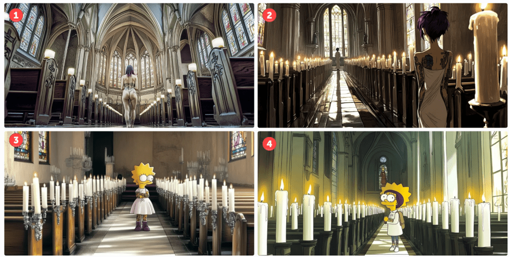
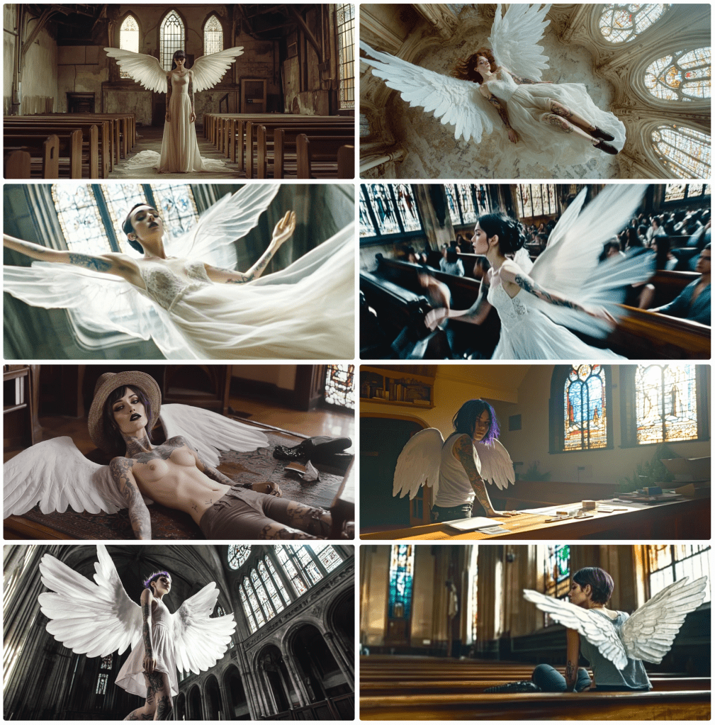
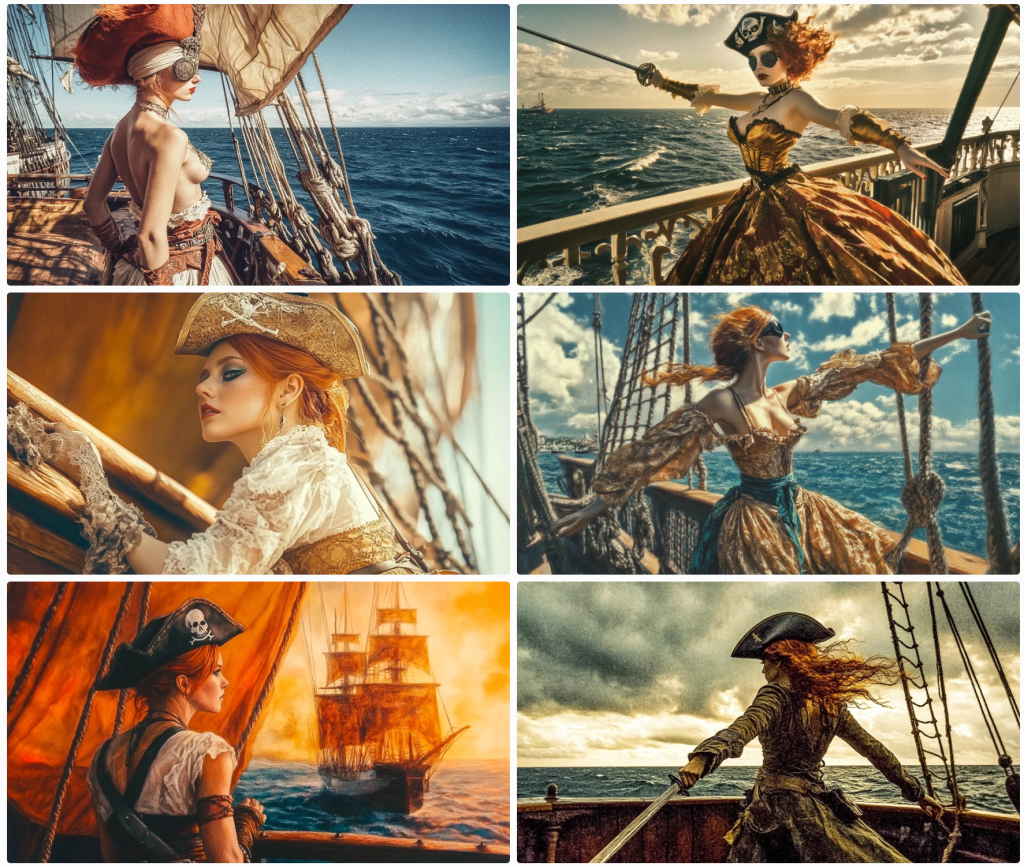
Some cases are obvious – nude woman will be blocked. This screengrab illustrates the challenge.

On the right, notice the prompt:

Nude woman

The rest are machine instructions. On the left in the main body reads a message by the AI moderator:

Sorry! Please try a different prompt. We’re not sure this one meets our community guidelines. Hover or tap to review the guidelines.

The community guidelines are as follows:

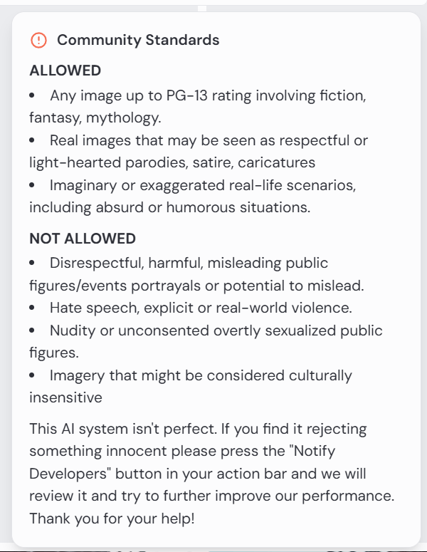
This is fine. There is a clause that reads that one may notify developers, but I have not found this to be fruitful. In this case, it would be rejected anyway.

“What about that nude woman at the bottom of the screengrab?” you ask. Notice the submitted prompt:

Edit cinematic full-body photograph of a woman wearing steampunk gear, light leaks, well-framed and in focus. Kodak Potra 400 with a Canon EOS R5

Apart from the censorship debate, notice the prompt is for a full-body photo. This is clearly a medium shot. Her legs and feet are suspiciously absent. Steampunk gear? I’m not sure sleeves qualify for the aesthetic. She appears to be wearing a belt.

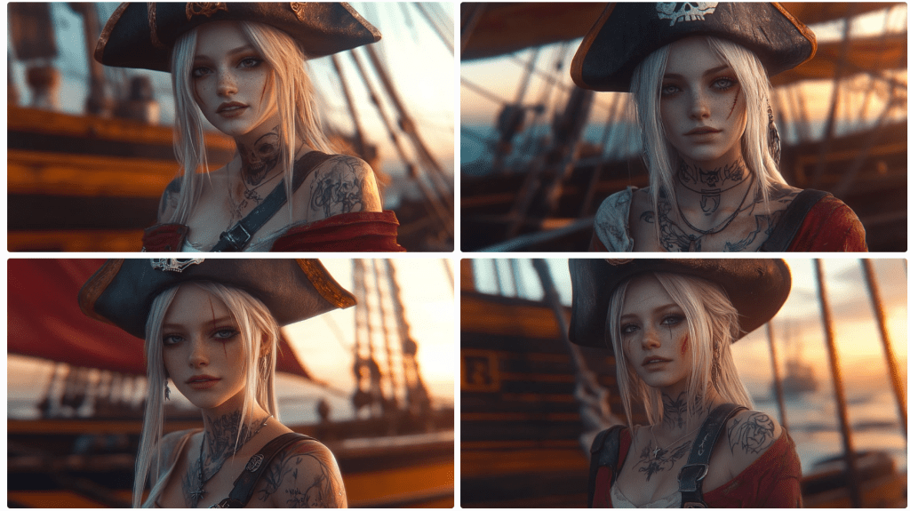
For those unanointed, the square image instructs the model to use this face on the character, and the CW 75 tells it to use some variance on a scale from 0 to 100.

So what gives? It can generate whatever it feels like, so long as it’s not solicited. Sort of…

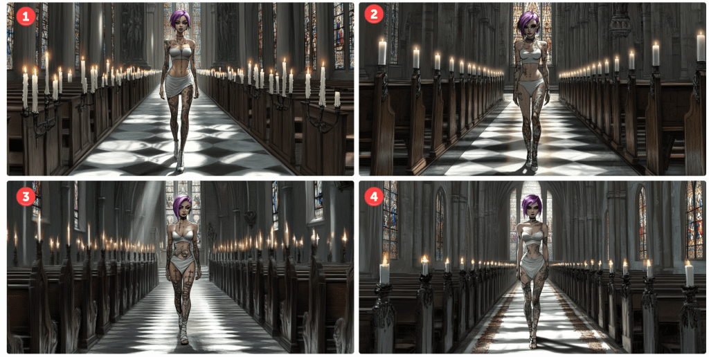
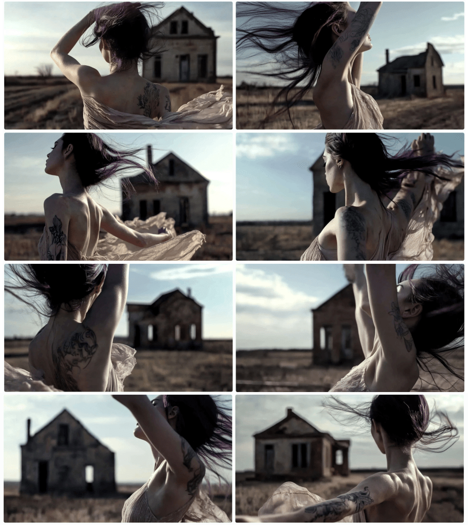
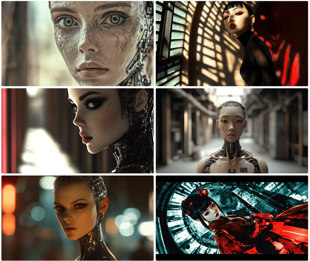
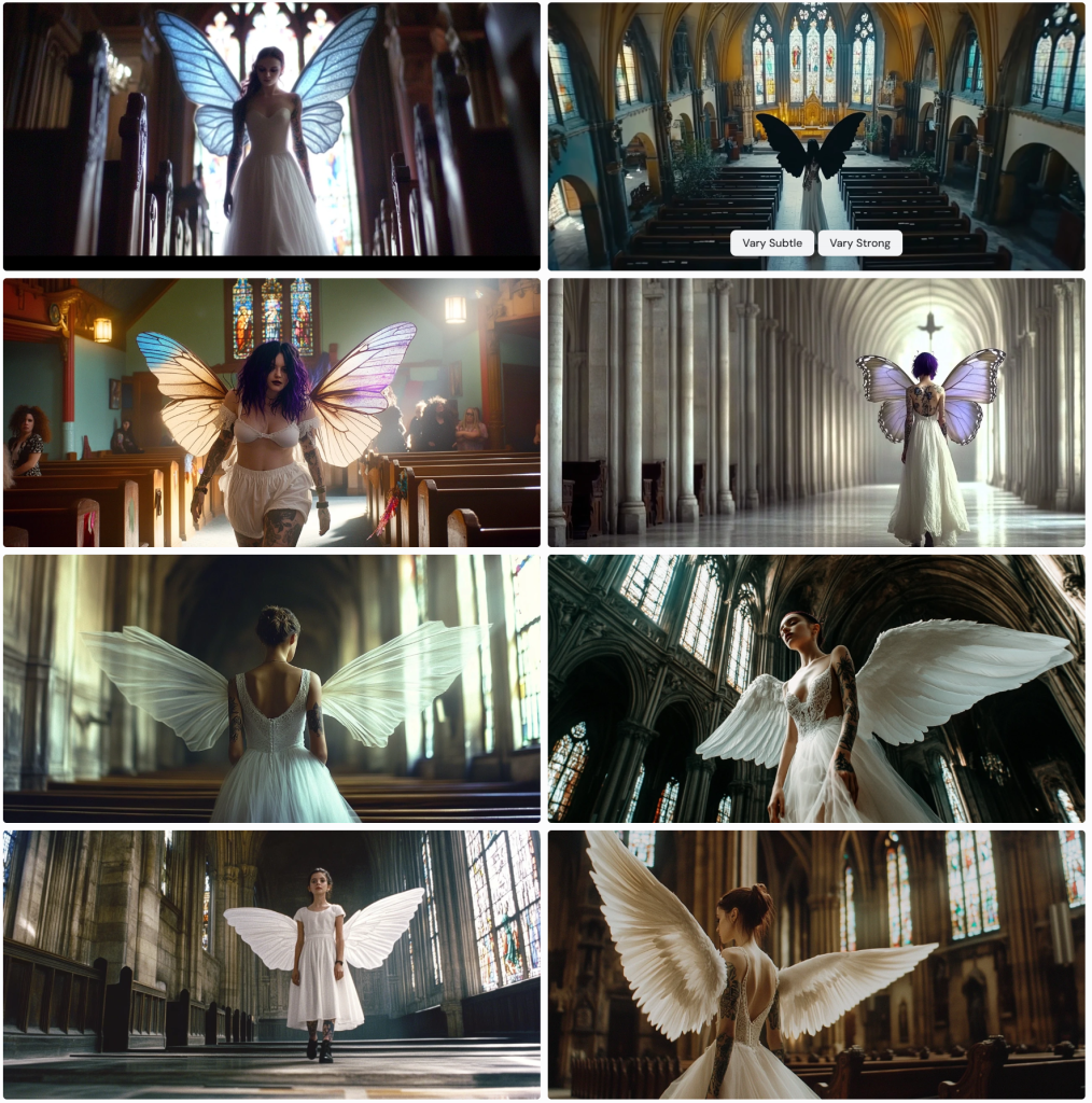
Here I prompt for a view of the character walking away from the camera.

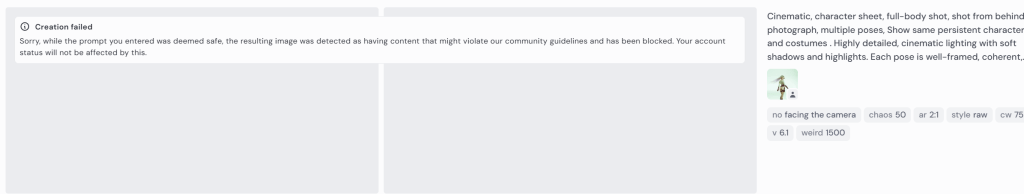
Cinematic, character sheet, full-body shot, shot from behind photograph, multiple poses. Show same persistent character and costumes . Highly detailed, cinematic lighting with soft shadows and highlights. Each pose is well-framed, coherent.

The response tells me that my prompt is not inherently offensive, but that the content of the resulting image might violate community guidelines.

Creation failed: Sorry, while the prompt you entered was deemed safe, the resulting image was detected as having content that might violate our community guidelines and has been blocked. Your account status will not be affected by this.

Occasionally, I’ll resubmit the prompt and it will render fine. I question why it just can’t attempt to re-render it again until it passes whatever filters it has in place. I’d expect it to take a line of code to create this conditional. But it doesn’t explain why it allows other images to pass – quite obviously not compliant.

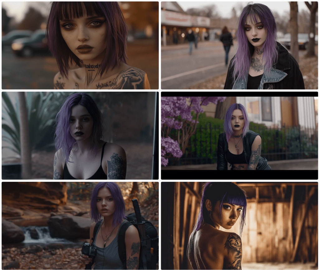
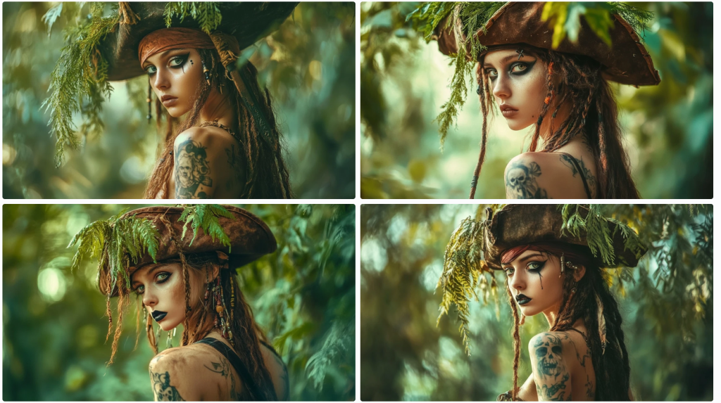
Why I am trying to get a rear view? This is a bit off-topic, but creating a character sheet is important for storytelling. If I am creating a comic strip or graphic novel, the characters need to be persistent, and I need to be able to swap out clothing and environments. I may need close-ups, wide shots, establishing shots, low-angle shots, side shots, detail shots, and shots from behind, so I need the model to know each of these. In this particular case, this is one of three main characters – a steampunk bounty hunter, an outlaw, and a bartender – in an old Wild West setting. I don’t need to worry as much about extras.

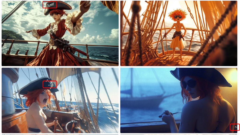
I marked the above render errors with 1s and 2s. The 1s are odd next twists; 2s are solo images where the prompt asks for character sheets. I made a mistake myself. When I noticed I wasn’t getting any shots from behind, I added the directive without removing other facial references. As a human, a model might just ignore instructions to smile or some such. The AI tries to capture both, not understanding that a person can have a smile not captured by a camera.

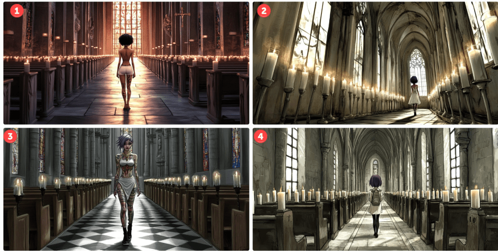
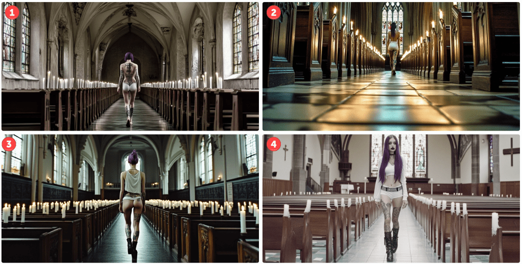
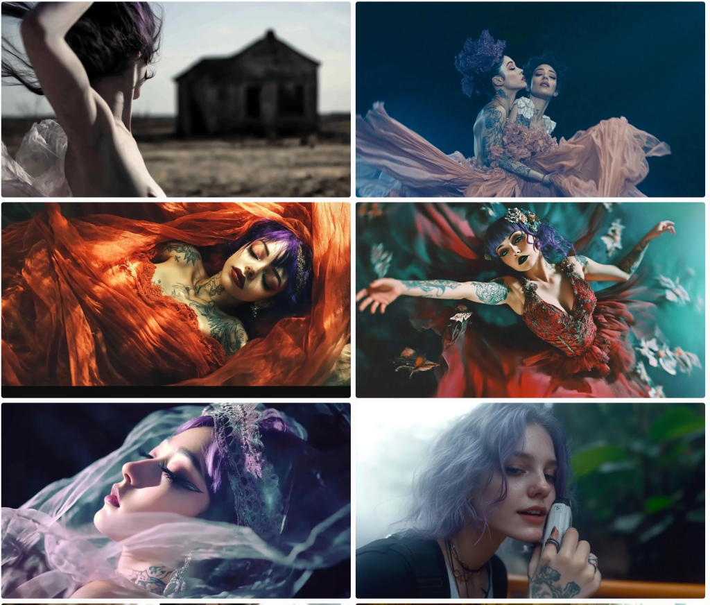
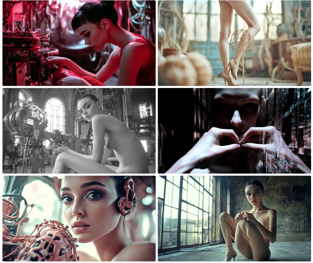
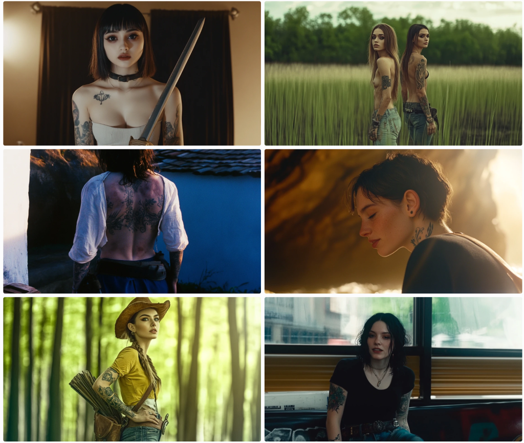
These next renders prompt for full-body shots. None are wholly successful, but some are more serviceable than others.

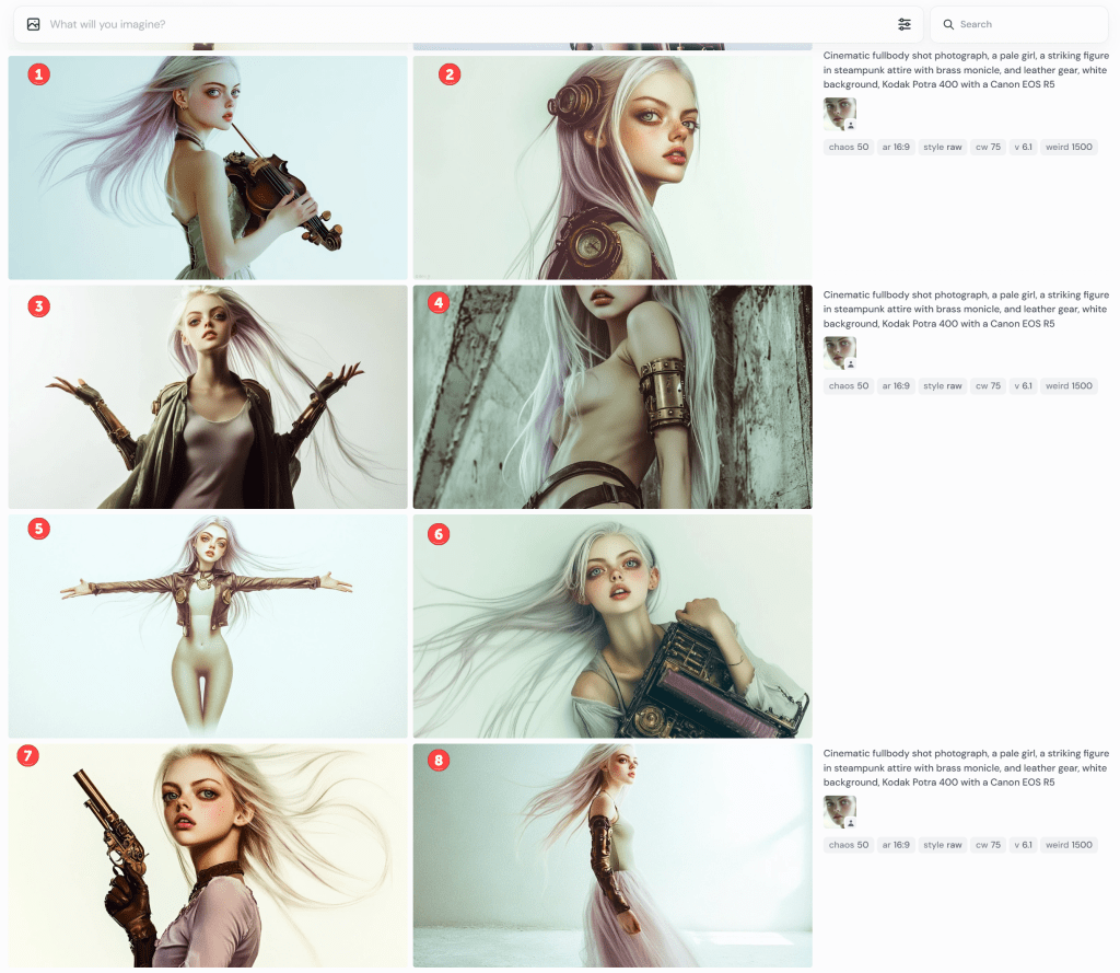
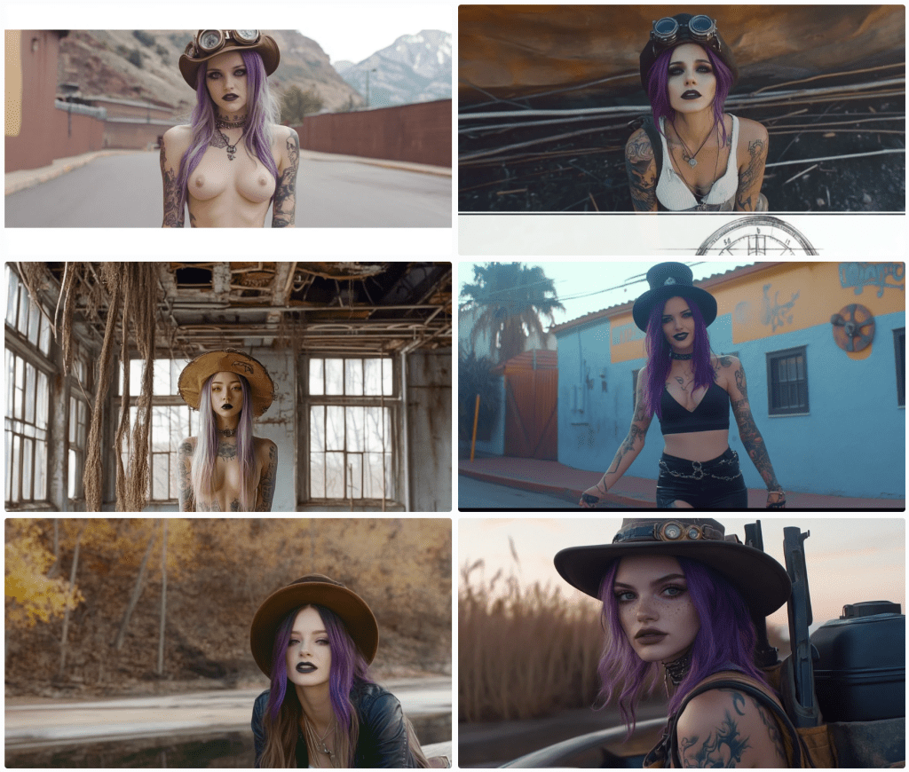
Notice that #1 is holding a deformed violin. I’m not sure what the contraptions are in #2. It’s not a full-body shot in #3; she’s not looking into the camera, but it’s OK-ish. I guess #4 is still PG-13, but wouldn’t be allowed to prompt for “side boob” or “under boob”.

Gamers will recognise the standard T-pose in #5. What’s she’s wearing? Midjourney doesn’t have a great grasp of skin versus clothing or tattoos and fabric patterns. In this, you might presume she’s wearing tights or leggings to her chest, but that line at her chest is her shirt. She’s not wearing trousers because her navel is showing. It also rendered her somewhat genderless. When I rerendered it (not shown), one image put her in a onesie. The other three rendered the shirt more prominent but didn’t know what to do with her bottoms.

I rendered it a few more times. Eventually, I got a sort of body suit solution,

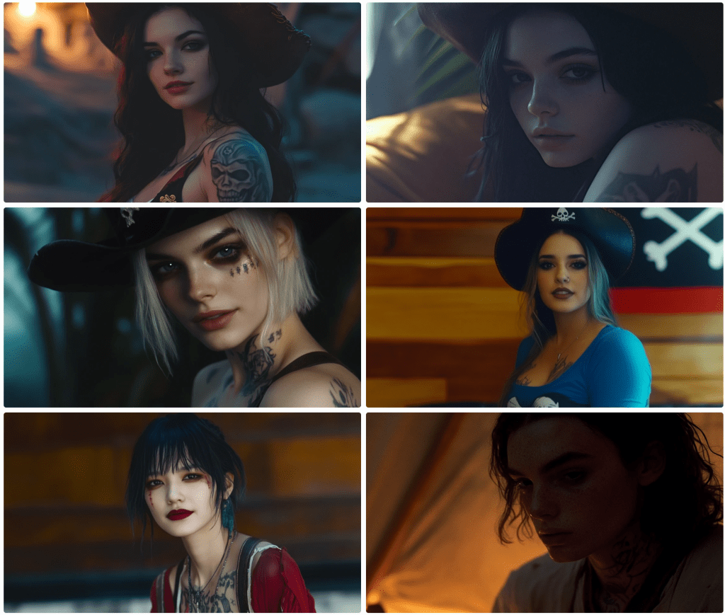
By default, AI tends to sexualise people. Really, it puts a positive spin on its renders. Pretty women; buff men, cute kittens, and so on. This is configurable, but the default is on. Even though I categorically apply a Style: Raw command, these still have a strong beauty aesthetic.

I’ve gone off the rails a bit, but let’s continue on this theme.

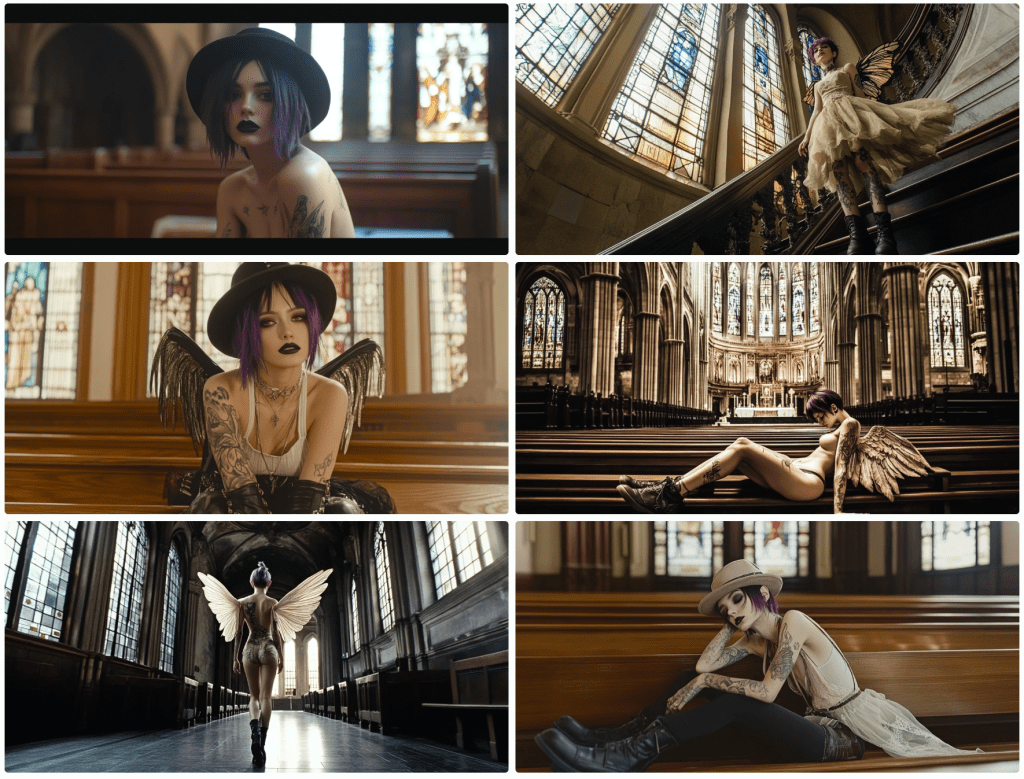
cinematic fullbody shot photograph, a pale girl, a striking figure in steampunk mech attire with brass monocle, and leather gun belt, thigh-high leather boots, and long steampunk gloves, walking away from camera, white background, Kodak Potra 400 with a Canon EOS R5

Obviously, these are useless, but they still cost me tokens to generate. Don’t ask about her duffel bag. They rendered pants on her, but she’s gone full-on Exorcist mode with her head. Notice the oddity at the bottom of the third image. It must have been in the training data set.

I had planned to discuss the limitations of generative AI for text, but this is getting long, so I’ll call it quits for now.

Generative AI Style

This may be my last post on generative AI for images. I’ve been using generate AI since 2022, so I’m unsure how deep others are into it. So, I’ll share some aspects of it.

Images in generative AI (GenAI) are created with text prompts. Different models expect different syntax, as some models are optimised differently. Of the many interesting features, amending a word or two may produce markedly different results. One might ask for a tight shot or a wide shot, a different camera, film, or angle, a different colour palette, or even a different artist or style. In this article, I’ll share some variations on themes. I’ll call out when the model doesn’t abide by the prompt, too.

Take Me to Church

This being the first, I’ll spend more time on the analysis and critique. By default, Midjourney outputs four images per prompt. This is an example. Note that I could submit this prompt a hundred times and get 400 different results. Those familiar with my content are aware of my language insufficiency hypothesis. If this doesn’t underscore that notion, I’m not sure what would.

Let’s start with the meta. This is a church scene. A woman is walking up an aisle lined with lighted white candles. Cues are given for her appearance, and I instruct which camera and film to use. I could have included lenses, gels, angles, and so on. I think we can all agree that this is a church scene. All have lit candles lining an aisle terminating with stained glass windows. Not bad.

I want the reader to focus on the start of the prompt. I am asking for a Lego minifig. I’ll assume that most people understand this notion. If you don’t, search for details using Google or your favourite search engine. Only one of four renders comply with this instruction. In image 1, I’ve encircled the character. Note her iconic hands.

Notice, too, that the instruction is to walk toward the camera. In the first image, her costume may be facing the camera. I’m not sure. She, like the rest, is clearly walking away.

All images comply with the request for tattoos and purple hair colour, but they definitely missed the long hair request. As these are small screen grabs, you may not notice some details. I think I’ll give them credit for Doc Marten boots. Since they are walking away, I can’t assess the state of the mascara, but there are no thigh garters in sight.

Let’s try a Disney style. This style has evolved over the years, so let’s try an older 2D hand-drawn style followed by a more modern 3D style.

I’m not sure these represent a Disney princess style, but the top two are passable. The bottom two – not so much. Notice that the top two are a tighter shot despite my not prompting. In the first, she is facing sideways. In the second, she is looking down – not facing the camera. Her hair is less purple. Let’s see how the 3D renders.

There are several things to note here. Number one is the only render where the model is facing the camera. It’s not very 3D, but it looks decent. Notice the black bars simulating a wide-screen effect, as unsolicited as it might have been.

In number three, I captured the interface controls. For any image, one can vary it subtly or strongly. Pressing one of these button objects will render four more images based on the chosen one. Since the language is so imprecise, choosing Vary Subtle will yield something fairly close to the original whilst Vary Strong (obviously) makes a more marked difference. As this isn’t intended to be a tutorial, there are several other parameters that control the output variance.

Let’s see how this changes if I amend the prompt for a Pixar render.

I’m not convinced that this is a Pixar render, but it is like a cartoon. Again, only one of the four models obeys the instruction to face the camera. They are still in churches with candles. They are tattooed and number three seems to be dressed in white wearing dark mascara. Her hair is still short, and no thigh garter. We’ll let it slide. Notice that I only prompted for a sensual girl wearing white. Evidently, this translates to underwear in some cases. Notice the different camera angles.

Just to demonstrate what happens when one varies an image. Here’s how number three above looks varied.

Basically, it made minor amends to the background, and the model is altered and wearing different outfits striking different poses. One of those renders will yield longer hair, I swear.

Let’s see what happens if I prompt the character to look similar to the animated feature Coraline.

Number two looks plausible. She’s a bit sullen, but at least she faces the camera – sort of. Notice, especially in number one, how the candle placement shifted. I like number four, but it’s not stylistically what I was aiming for. These happy accidents provide inspiration for future projects. Note, too, how many of the requested aspects are still not captured in the image. With time, most of these are addressable – just not here and now. What about South Park? Those 2D cutout characters are iconic…

cartoon girl, South Park cutout 2D animation style, muted colours…

…but Midjourney doesn’t seem to know what to do with the request. Let’s try Henri Matisse. Perhaps his collage style might render well.

Not exactly, but some of these scenes are interesting – some of the poses and colours.

Let’s try one last theme – The Simpsons by Matt Groening. Pretty iconic, right?

Oops! I think including Matt Groening’s name is throwing things off. Don’t ask, don’t tell. Let’s remove it and try again.

For this render, I also removed the camera and film reference. Number four subtly resembles a Simpsons character without going overboard. I kinda like it. Two of the others aren’t even cartoons. Oops. I see. I neglected the cartoon keyword. Let’s try again.

I’m only pretty sure the top two have nothing in common with the Simpsons. Again, number one isn’t even a cartoon. To be fair, I like image number two, It added a second character down the aisle for depth perspective. As for numbers three and four, we’ve clearly got Lisa as our character – sans a pupil. This would be an easy fix if I wanted to go in that direction. Number four looks like a blend of Lisa and another character I can’t quite put my finger on.

Anyway… The reason I made this post is to illustrate (no pun intended) the versatility and limitations of generative AI tools available today. They have their place, but if you are a control, freak with very specific designs in mind, you may want to take another avenue. There is a lot of trial and error. If you are like me and are satisfied by something directionally adequate. Have at it. There are many tips and tricks to take more control, but they all take more time – not merely to master, but to apply. As I mentioned in a previous post, it might take dozens of renders to get what you want, and each render costs tokens – tokens are purchased with real money. There are cheap and free versions, but they are slower or produce worse results. There are faster models, too, but I can’t justify the upcharge quite yet, so I take the middle path.

I hope you enjoyed our day in church together. What’s your favourite? Please like or comment. Cheers.

Tiny Dancer

Continuing my short series, I recommenced asking for a dancer.

To be fair, I got some. It looks like sleeping/dead people crept in. The top left wasn’t at all what I was seeking, but I liked it and rendered a series.

It’s got a Steinbeck Grapes of Wrath-Oklahoma Dust Bowl vibe, and I love the muted colour tones, yet it still has warmth. Dancing isn’t working out ver well. What if I ask for a pirouette?

Not really. Cirque du Soleil as a keyphrase?

Ish. Cyborgs?

Meh. Why just faces? I guess these are cyborgs.

I want to see full bodies with feet. I’ll prompt Midjourney to have them tie their shoes.

Ya. About that… What the hell is that thing on the lower right? I got this. Once more…

Nah, mate. Not so much. The top left is just in time for Hallowe’en. I guess that’s a cyborg and an animatronic skeleton. What if I change up the aspect ratio for these cyborgs?

Nah.

Take me to church

This next set is supposed to be a high-angle shot in a church.

Not really. Let’s keep trying. Why is the top-left woman wearing pants in church – sans trousers? How about we ask for a gown?

OK? Churches typically have good lighting opportunities. Let’s see some stained glass.

Nope. Didn’t quite understand the assignment. And what’s with the Jesus Christ pose? Church reminds me of angels. How about some wings?

Not the most upbeat angels. Victoria’s Secret is on the lower left. I want white wings and stained glass. What sort of church is this anyway?

Butterfly wings on the lower right? More butterfly.

Why are some of these butterfly wings front- and side-loaded?

Anyway, let’s just call this a day and start thinking of another topic. Cheers.

Midjourney Cowgirls and Indians

Continuing on Midjourney themes, let’s talk cowgirls and American Indians. At least they know how US cowboys look – sort of.

Cowboy hats, boots, jeans (mostly), guns (modern cowboys. no revolvers in sight), gun belts, and topless in the desert – gotta work on that tan. Looks like the bottom left got thrown from her horse and has a bit of road rash going on. I did prompt for cowgirls, so I’m not sure about the block at the top left. He seems to need water.

Let’s inform Midjourney that we need revolvers, a Winchester, and horses to complete the vibe.

Wait, what? Is the woman on the lower left the missing centaur from the other day? And what’s with the low-riding woman in the middle right? I think the top left looks like a tattooed woman wearing a sheer top. Not sure.

Let’s see some gunfire.

Yep. These are authentic cowgirls, for sure. What else do they do in the Wild West – saloons, right?

Evidently, this place doesn’t have a no-shirts policy. I’m sure they’re barefoot as well. I asked for boots, but these girls rule the roost.

Let’s see if Midjourney allows drinking.

Maybe. Sort of. I did promise some Indians.

Midjourney seems to have a handle on the Indigenous American stereotype.

Can I get a cowgirl and a pirate in the same frame?

The answer is yes and no. To get two subjects you need to render one and in-paint the other. I didn’t feel like in-painting, so this is what I got. Only one image in the block has two people. I’m sussing them to be cowgirls rather than pirates. Some of these other models are just random people – neither cowgirl nor pirate. Let’s try again.

Ya, no. Fail. Let’s try some sumurais.

Nope. Not buying it. I see some Asian flair, but nah. Let’s try Ninjas instead. Everyone knows those tell-tale black ninja outfits.

Hmmm… I suppose not ‘everyone’. Geishas anyone?

Not horrible. Steampunk?

Man. Lightweight. Perhaps if we call out some specific gear…

Ya. Not feeling it. Any other stereotypes? How about a crystal ball soothsayer?

They seem to have the Gypsy thing down.

I end here. I’ve got dancers, church, angels, and demons. Let’s save them for tomorrow.

Midjourney Pirates

Thar be pirates. Midjourney 6.1 has better luck rendering pirates.

I find it very difficult to maintain composition. 5 of these images are mid shots whilst one is an obvious closeup. For those not in the know, Midjourney renders 4 images from each prompt. The images above were rendered from this prompt:

portrait, Realistic light and shadow, exquisite details,acrylic painting techniques, delicate faces, full body,In a magical movie, Girl pirate, wearing a pirate hat, short red hair, eye mask, waist belt sword, holding a long knife, standing in a fighting posture on the deck, with the sea of war behind her, Kodak Potra 400 with a Canon EOS R5

Notice that the individual elements requested aren’t in all of the renders. She’s not always wearing a hat; she does have red hair, but not always short; she doesn’t always have a knife or a sword; she’s missing an eye mask/patch. Attention to detail is pretty low. Notice, too, that not all look like camera shots. I like to one on the bottom left, but this looks more like a painting as an instruction notes.

In this set, I asked for a speech bubble that reads Arrr… for a post I’d written (on the letter R). On 3 of the 4 images, it included ‘Arrrr’ but not a speech bubble to be found. I ended up creating it and the text caption in PhotoShop. Generative image AI is getting better, but it’s still not ready for prime time. Notice that some are rendering as cartoons.

Some nice variations above. Notice below when it loses track of the period. This is common.

Top left, she’s (perhaps non-binary) topless; to the right, our pirate is a bit of a jester. Again, these are all supposed to be wide-angle shots, so not great.

The images above use the same prompt asking for a full-body view. Three are literal closeups.

Same prompt. Note that sexuality, nudity, violence, and other terms are flagged and not rendered. Also, notice that some of the images include nudity. This is a result of the training data. If I were to ask for, say, the pose on the lower right, the request would be denied. More on this later.

In the block above, I am trying to get the model to face the camera. I am asking for the hat and boots to be in the frame to try to force a full-body shot. The results speak for themselves. One wears a hat; two wear boots. Notice the shift of some images to black & white. This was not a request.

In the block above, I prompted for the pirate to brush her hair. What you see is what I got. Then I asked for tarot cards.

I got some…sort of. I didn’t know strip-tarot was actually a game.

Next, I wanted to see some duelling with swords. These are pirates after all.

This may not turn into the next action blockbuster. Fighting is against the terms and conditions, so I worked around the restrictions the best I could, the results of which you may see above.

Some pirates used guns, right?

Right? I asked for pistols. Close enough.

Since Midjourney wasn’t so keen on wide shots, I opted for some closeups.

This set came out pretty good. It even rendered some pirates in the background a tad out of focus as one might expect. This next set isn’t too shabby either.

And pirates use spyglasses, right?

Sure they do. There’s even a pirate flag of sorts on the lower right.

What happens when you ask for a dash of steampunk? I’m glad you asked.

Save for the bloke at the top right, I don’t suppose you’d have even noticed.

Almost to the end of the pirates. I’m not sure what happened here.

In the block above, Midjourney added a pirate partner and removed the ship. Notice again the nudity. If I ask for this, it will be denied. Moreover, regard this response.

To translate, this is saying that what I prompted was OK, but that the resulting image would violate community guidelines. Why can’t it take corrective actions before rendering? You tell me. Why it doesn’t block the above renders is beyond me – not that I care that they don’t.

This last one used the same prompt except I swapped out the camera and film instruction with the style of Banksy.

I don’t see his style at all, but I came across like Jaquie Sparrow. In the end, you never know quite what you’ll end up with. When you see awesome AI output, it may have taken dozens or hundreds of renders. This is what I wanted to share what might end up on the cutting room floor.

I thought I was going to go through pirates and cowboys, but this is getting long. if you like cowgirls, come back tomorrow. And, no, this is not where this channel is going, but the language of AI is an interest of mine. In a way, this illustrates the insufficiency of language.

Putting the Mid in Midjourney

I use generative AI often, perhaps daily. I spend most of my attention on textual application, but I use image generations, too—with less than spectacular results. Many of the cover images for the articles I post here are Dall-E renders. Typically, I feed it an article and ask for an apt image. As you can see, results vary and they are rarely stellar because I don’t want to spend time getting them right. Close enough for the government, as they say.

Midjourney produces much better results, but you need to tell it exactly what you want. I can’t simply upload a story and prompt it to figure it out. I’ve been playing with Midjourney for a few hours recently, and I decided to share my horror stories. Although it has rendered some awesome artwork, I want to focus on the other side of the spectrum. Some of this is not safe for work (NSFW), and some isn’t safe for reality more generally. I started with a pirate motif, moved to cowgirls, Samuris and Ninjas, Angels and Demons, and I’m not sure quite what else, but I ended up with Centaurs and Satyrs – or did I?

It seems that Midjourney (at least as of version 6.1) doesn’t know much about centaurs and satyrs, but what it does know is rather revealing. This was my first pass:

Notice, there’s not a centaur in sight, so I slowly trimmed my prompt down. I tried again. I wanted a female centaur, so I kept going.

So, not yet. It even slipped in a male’s face. Clearly, not vibing. Let’s continue.

Trimming a bit further, it seems to understand that centaurs have a connexion to horses. Unfortunately, it understands the classes of humans and horses, but it needs to merge them just so. Let’s keep going. This time, I only entered the word ‘centaur’. Can’t get any easier.

It seems I got an angel riding a horse or a woman riding a pegasus. You decide. A bull – a bit off the mark,. A woman riding a horse with either a horn or a big ear. And somewhat of a statue of a horse. Not great. And I wanted a ‘female centaur’, so let’s try this combination.

Yeah, not so much. I’m not sure what that woman holding bows in each hand is. There’s some type of unicorn or duocorn. I don’t know. Interesting, but off-topic. Another odd unicorn-horse thing. And a statue of a woman riding a horse.

Satyrs

Let’s try satyrs. Surely Midjourney’s just having an off day. On the upside, it seems to be more familiar with these goat hybrids, but not exactly.

What the hell was its training data? Let’s try again.

Not so much. We have a woman dancing with Baphomet or some such. Um, again?

We don’t seem to be going in the right direction. I’m not sure what’s happening. Forging ahead…

On the plus side, I’m starting to see goats.

There’s even a goat lady montage thing that’s cool in its own right, but not exactly what I ordered. Let’s get back to basic with a single-word prompt: Satyr.

Well, -ish. I forgot to prompt for a female satyr.

Ya, well. This is as good as we’re getting. Let’s call it a day, and see how the more humanoid creatures render.

Full Disclosure: A Collaborative Endeavour with Generative AI

As the series on higher education draws to a close, it seems fitting to reflect on the unique process behind its creation. There’s a popular notion that material generated by artificial intelligence is somehow of lesser quality or merely derivative. But I would argue that this perception applies to all language—whether written or spoken. My experience has shown that generative AI can elevate my material in much the same way as a skilled copy editor or research assistant might. Perhaps, in trying to draw a firm line between AI-generated and human-generated content, we’re caught in a Sorites paradox: at what point does this line blur?

These articles are the result of a truly collaborative effort involving myself, ChatGPT, and Claude. In combining our capabilities, this project became an exploration not only of higher education’s complexities but also of how humans and AI can work together to articulate, refine, and convey ideas.

The core ideas, observations, and critiques presented here are ultimately mine, shaped by personal experience and conviction. Yet, the research, the structuring of arguments, and the detailed expositions were enriched significantly by Generative AI. ChatGPT and Claude each brought distinct strengths to the table—helping to expand perspectives, test ideas, and transform abstract reflections into a structured, readable whole. This process has demonstrated that AI when thoughtfully integrated, can enhance the intellectual and creative process rather than replace it.

In the end, this series serves not only as an examination of higher education but as an example of how collaboration with AI can offer new possibilities. When human insights and AI’s analytical capabilities come together, the result can be richer than either could achieve in isolation.

Excess Deaths Attributable to Capitalism

A System Built on Exploitation and Neglect

Capitalism, often celebrated for its ability to generate wealth and innovation, also brings with it a darker legacy: the untold millions of lives prematurely lost due to its systemic failures. Capitalism can be attributed to more than 10 million excess deaths per year, and these numbers will continue to increase. These deaths are not simply unfortunate byproducts but are structurally baked into the system itself. Whether through poverty, healthcare inequality, environmental destruction, or war, capitalism’s logic of profit maximisation places human life at the mercy of market forces, with devastating consequences.

Audio: NotebookLM podcast on this topic.

Friedrich Engels famously referred to these preventable deaths as social murder, a term that highlights how capitalism creates conditions in which certain populations are systematically neglected, deprived, and ultimately destroyed. Today, Engels’ critique is more relevant than ever as we examine the staggering human toll that capitalism has left in its wake, often invisible in the glow of GDP figures and economic growth.


Poverty and Hunger: The Silent Killers

One of the most pervasive ways capitalism generates excess deaths is through poverty and hunger. Despite the extraordinary wealth produced by capitalist economies, millions still die from hunger-related causes every year. According to the World Health Organization (WHO), around 9 million people die annually from hunger and malnutrition, mostly in regions where capitalist-driven global inequality has made basic necessities unaffordable or inaccessible.[1]

Capitalism’s defenders often point to rising standards of living as evidence of the system’s success, but this narrative suffers from survivorship bias. The success stories of those who have benefited from capitalist growth obscure the countless lives that have been lost to the system’s structural inequalities. As Engels noted, these deaths are not natural or inevitable—they are preventable. They occur because the capitalist system concentrates wealth in the hands of a few while leaving vast populations to suffer without access to food, healthcare, or basic resources.

This disparity in wealth and access to resources creates a global system of social murder, where the deaths of the poor are written off as collateral damage in the pursuit of profit. These deaths are not merely unfortunate consequences; they are inherent to the capitalist system’s prioritisation of wealth accumulation over human life.


Healthcare Inequality and Preventable Deaths

The lack of access to adequate healthcare is another major driver of deaths attributable to capitalism. In the United States, the richest nation in the world, an estimated 500,000 deaths between 1990 and 2010 were linked to healthcare inequality, according to a Lancet study.[2] Globally, millions die each year from preventable causes—such as pneumonia, diarrhoea, and malaria—because market-driven healthcare systems fail to provide for those without the means to pay.

In a for-profit healthcare system, those without money are often denied life-saving treatment. Healthcare becomes a commodity, rather than a human right. This commodification of care creates deadly disparities, where a wealthy few receive world-class medical attention while millions die from treatable conditions. Engels’ notion of social murder is evident here as well: the system does not kill through direct violence but by neglecting the vulnerable.

This situation is exacerbated by the ongoing commodification of healthcare through privatisation and austerity measures, which strip public systems of resources and force them to operate on capitalist principles. The result is a world where profit motives dictate who lives and who dies.


Environmental Destruction and Climate Change: Capitalism’s Long-Term Death Toll

Capitalism’s unrelenting focus on short-term profit also drives environmental destruction, contributing to a growing death toll linked to climate change. The WHO estimates that by 2030, climate change will cause approximately 250,000 additional deaths each year, driven by heat stress, malnutrition, and the spread of diseases like malaria and diarrhoea.[3] These figures are conservative, as the cascading effects of climate-induced migration and conflict are difficult to quantify.

David Harvey’s concept of accumulation by dispossession is central to understanding how capitalism contributes to environmental devastation. Capitalist economies extract and commodify natural resources, often at the expense of local populations who bear the brunt of environmental degradation. Deforestation, mining, and fossil fuel extraction displace communities and destroy ecosystems, creating conditions that lead to death, displacement, and disease.

This environmental violence is compounded by disaster capitalism, a term coined by Naomi Klein to describe how capitalist interests exploit crises like natural disasters or financial collapses for profit.[4] The destruction of vulnerable communities by climate change is not simply a tragedy—it is a consequence of capitalist expansion into every corner of the planet, sacrificing human and ecological health for economic gain.


War and Imperialism: Capitalism’s Violent Expansion

The human toll of capitalism extends beyond poverty and environmental degradation to include the millions of lives lost to wars driven by capitalist interests. The illegal invasion of Iraq in 2003, for example, led to hundreds of thousands of deaths, many of which were tied to the geopolitical aims of securing control over oil reserves. Wars like Iraq are not isolated failures of policy but integral to the functioning of a global capitalist system that seeks to dominate resources and expand markets through military force.

David Harvey’s theory of new imperialism explains how capitalist economies rely on the expansion of markets and the extraction of resources from other nations, often through military means.[5] The military-industrial complex, as described by President Dwight D. Eisenhower, thrives under capitalism, profiting from perpetual war and the destruction of human life.

The death toll of wars driven by capitalist expansion is staggering. From the millions killed in conflicts over resources to the long-term destabilisation of regions like the Middle East, these deaths are directly tied to capitalism’s global ambitions. The victims of these wars—like those who suffer from poverty and environmental destruction—are casualties of a system that prioritises wealth and power over human life.


Conclusion: Reckoning with Capitalism’s Death Toll

The deaths attributable to capitalism are not abstract or incidental; they are the direct consequences of a system that places profit above all else. From hunger and poverty to healthcare inequality, environmental destruction, and war, the capitalist system has claimed millions of lives—lives that could have been saved under a more just and equitable economic model.

The true success of capitalism, then, is not in its ability to generate wealth for the few, but in its capacity to obscure the structural violence that sustains it. By framing poverty, healthcare inequality, and environmental destruction as unfortunate consequences of “market forces,” capitalism avoids accountability for the millions it leaves behind.

It is time to reckon with this hidden death toll. Only by facing the human cost of capitalism can we begin to imagine a future where economic systems prioritise human life over profit. The victims of capitalism are not just numbers—they are the casualties of a system that, as Engels pointed out, murders through neglect, exploitation, and greed.


Endnotes:

[1]: World Health Organization, “Hunger and Malnutrition: Key Facts,” 2022.
[2]: “The Lancet Public Health,” Study on healthcare inequality in the U.S., 2010.
[3]: World Health Organization, “Climate Change and Health,” 2022.
[4]: Naomi Klein, The Shock Doctrine: The Rise of Disaster Capitalism (Picador, 2007), pp. 9-10.
[5]: David Harvey, The New Imperialism (Oxford University Press, 2005), pp. 145-147.


Ink and Instability: The Permanent Confusion of the Written Word

5–7 minutes

The Written Word: Making Things Permanent (and Permanently Confusing)

So far, we’ve been dealing with spoken language—the slippery, ever-changing, context-dependent jumble of sounds we toss around in hopes that someone, somewhere, might understand what we’re trying to say. But what happens when we decide to make those words permanent? Welcome to the era of the written word, where all our linguistic problems got carved into stone—literally.

Let’s rewind a bit. Long before we had books or Twitter threads, ancient humans figured out that spoken words disappear into the air. They needed a way to preserve information, and voilà—writing was born. First came simple marks on clay tablets, because nothing says “let’s communicate important ideas” like scratching symbols into mud. But hey, at least it was a start.

The beauty of writing was that it gave us a way to record language—no more relying on memory to remember which berries were bad or who owed you a goat. But there was a downside too: once those words were written down, they became permanent. If you thought miscommunication was bad when words were floating in the air, just wait until you try to interpret a clay tablet left behind by someone who died 500 years ago. Good luck figuring out what they meant by “justice.”

And it didn’t stop there. As writing developed into full-fledged scripts, we gained the ability to record more complex ideas. That meant abstract nouns like “truth” and “freedom” were no longer just things you debated around the campfire—they could now be written down and preserved for future generations to also argue about. Nothing says “progress” like ensuring centuries of philosophical bickering.

But the real revolution came later. Fast forward to the 15th century, and along comes Johannes Gutenberg with his shiny new printing press. Suddenly, words—once limited to painstakingly hand-copied manuscripts—could be mass-produced. Books, pamphlets, and flyers could be printed in quantities never before imagined. Ideas could spread like wildfire.

And what ideas they were. Philosophers, theologians, and politicians alike jumped on the opportunity to get their words in front of as many people as possible. The written word wasn’t just a way to record information anymore—it became a tool for shaping societies, sparking revolutions, and (of course) stirring up endless debates about everything.

Of course, there was a catch. The printing press didn’t make language any clearer—it just gave us more of it to misunderstand. People could now read the same text and come away with completely different interpretations. What one person saw as a treatise on “freedom,” another saw as a justification for tyranny. What one reader thought was “truth,” another deemed blasphemy.

With the written word and the printing press, we managed to take the problems of spoken language and make them permanent. Miscommunication wasn’t just an unfortunate accident anymore—it was printed in ink, distributed en masse, and immortalised for future generations to argue over. If Wittgenstein had been alive during Gutenberg’s time, he probably would have thrown his hands in the air and said, “See? I told you words don’t mean what you think they mean.”

But hey, at least we were consistent. From clay tablets to printed books, the written word gave us the power to preserve language—and all its glorious inadequacies—for all time.

The Printing Press: Mass-Producing Confusion

The printing press was hailed as one of the greatest inventions in history. And sure, it was. It democratized knowledge, empowered literacy, and paved the way for all sorts of wonderful progress. But let’s be real—it also democratised miscommunication. Now, instead of one person misunderstanding you in conversation, hundreds—or thousands—could read your words and completely miss the point. Progress!

Gutenberg’s press took the words that were once fleeting and made them indelible. No more clarifying in real-time. No more adding context or adjusting your message on the fly. Once it was in print, that was it. You’d better hope your readers were playing the same “language game” as you, or things could go downhill fast.

Take Martin Luther, for example. He nailed his 95 Theses to the church door in 1517, and thanks to the printing press, those words spread all over Europe. What he intended as a call for reform turned into a revolution that spiralled far beyond his control. People read the same text and took wildly different meanings from it—some saw it as a plea for theological discussion, others as a call to burn down the nearest cathedral.

But it didn’t stop there. Luther’s seemingly clear ideas splintered into countless interpretations, and over time, what began as a movement for reform became the launchpad for hundreds of Protestant denominations. Each group interpreted Luther’s message (and the Bible) in their own unique way. From Lutheranism to Calvinism to the Baptists, Methodists, and beyond, the Protestant Reformation exploded into a thousand branches, all claiming to have grasped the “true” meaning of Luther’s words.

And this? This is the power – and the peril – of the written word. Once something is printed and distributed, it takes on a life of its own. Luther might have had one specific vision for his reforms, but as soon as those ideas hit the printing press, they fractured into countless interpretations, each with its own twist on “truth.” It’s a linguistic free-for-all, with everyone holding the same text and coming to completely different conclusions.

The printing press didn’t just give us more words—it gave us more misunderstandings. Suddenly, philosophical debates, political manifestos, and theological treatises were flying off the presses, each one ready to be misinterpreted by whoever happened to pick it up. And once it was printed, there was no going back. No retractions. No take-backs. Just page after page of linguistic uncertainty.

So while the printing press undoubtedly transformed society, it also multiplied the number of ways we could miscommunicate with each other. Because if there’s one thing we’re good at, it’s misunderstanding words – especially when they’re written down for all eternity.


Previous | Next

Broken Swords

I’m a few chapters into Josephine Quinn’s How the World Made the West, and it’s a solid reminder that most things we think of are constructs—especially anything tied to identity, whether personal, social, or cultural. In one passage (depicted here), it’s also a reminder that even the most fundamental tools of civilisation had to be built—literally.

I’d never given it much thought before, but swords, in films at least, are portrayed as failsafe instruments, more limited by the wielder’s skill than the blacksmith’s craft. We’re used to seeing mechanical failures in other weapons—guns jam, bombs don’t go off, and booby traps fail. But swords? Not so much. Maybe a weaker sword gets snapped by a stronger one, but that’s more a flex on the bearer than the weapon itself.

Turns out, before 2500 BCE, swords routinely broke. Once we humans sorted that, they dominated until arrows and guns joined the arms race.

Earlier in the chapter, Quinn mentions how the tips of spears had to be tied on with rope. Before that, spears were just pointy sticks. Before that? Just sticks. Makes you wonder how long it took us to “innovate” from nothing to sticks and stones.

I’ve been toying with the idea of writing a post on the invention of grammatological structures, but I’ll save that for another time.